
I’m indifferent to amphibians, but I do like tadpole charts. In this blog, I’m going to show you the steps to create one with a little trick around labelling that may be useful in making this chart – but also for other charts in Tableau.
Table of Contents
This ones a bit involved, so here’s a table of contents:
- What Exactly is a Tadpole Chart?
- Step 1: Create a Dot Plot of Profits by Product Sub-Category
- Step 2: Connect the Dots!
- Step 3: Creating the Tadpoles
- Step 4: Emphasising Difference Through Use of Colour
- Step 5: Nice Labels For Your Tadpoles But Only At Their Heads
- BONUS TIP: Giving Labels Space to Breathe Using Distribution Band
- Link to Tableau Public Workbook
What Exactly is a Tadpole Chart?
The tadpole chart is a variation of the dumbbell chart – or connected dot plot as they’re also often known – but in this case, one value (or ‘dot’) is removed to emphasise the other data point as well as the difference between two values on a plot canvas.
I particularly like them because they can help emphasise direction, and I have often used them in my work when I want to show change over time.
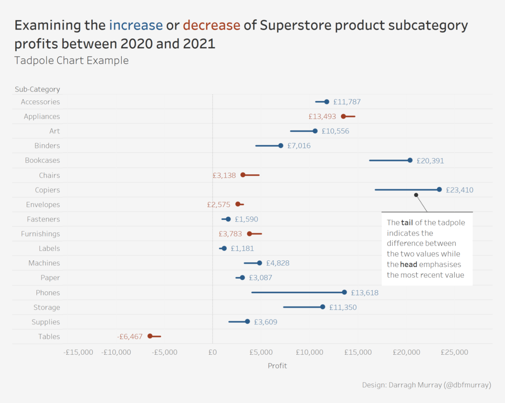
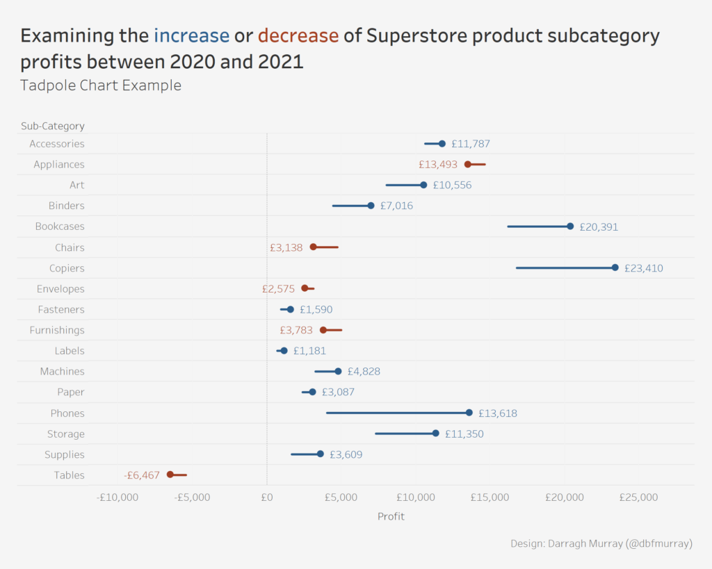
Here’s an example I built in Tableau using the default Superstore dataset, which shows how profits have changed by product subcategory between 2020 and 2021.
I’m not the first by any stretch of the means when building Tadpole Charts in Tableau, and a few others in the community have discussed their usefulness and how to create them.
- Read Mark Edward’s blog on the ‘spawning of the tadpole chart’ over at Points of Viz.
- Read Jeffrey Shaffer’s tutorial on how to create a tadpole chart over at Data+Science.
However, I wanted to give you a step-by-step just to revisit how exactly they can be done – and also share a little labelling hack that makes the labels turn out nice that can also be used in other charts such as dumbbells and likely other use cases.
Our objective in the below tutorial is to create a tadpole chart that shows change in profits between 2020 and 2021 by Product Sub-Category from Tableau’s default Superstore dataset.
Before we go any further, this tutorial assumes you have some basic familiarity with Tableau and also assumes you have familiarity with adding custom shapes into Tableau. If you’re not familiar with that, I suggest a read of this blog from Interworks on how to use shapes in Tableau. There is also one or two basic level of detail (LOD) expressions used which hopefully will be understandable even to Tableau beginners.
Let’s get cracking!
Step 1: Create a Dot Plot of Profits by Product Sub-Category
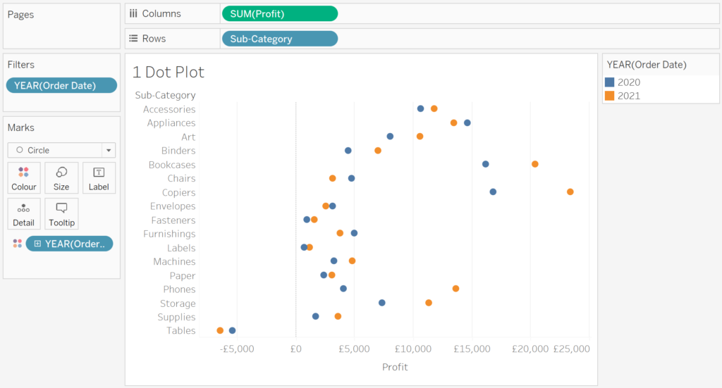
We start the process by building a simple dot plot. Here are the steps:
Boot up Tableau, locate yourself a copy of the Superstore dataset that comes with the product and open up a blank worksheet.
Drag PROFIT to columns and SUB-CATEGORY to rows and change your MARK TYPE to CIRCLE. Add ORDER DATE to the COLOUR mark – make sure the date aggregates to YEAR (which it should do by default), and the pill is discrete (e.g. coloured blue).
If you’ve done everything like the above, your chart should resemble the below figure. This figure already shows profits by sub-category for the years 2020 and 2021.
Step 2: Connect the Dots!
The following steps should be straightforward – you want to connect your year marks to emphasise the difference or distance between the years.
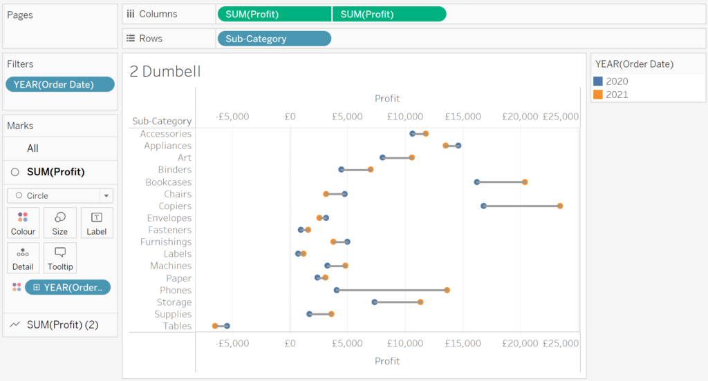
Place a DUPLICATE copy of the profit measure on the columns shelf to create a second axis. Right-click on one of the profit measures and select DUAL AXIS.
In the canvas, right-click on one of your profit AXIS and select SYNCHRONISE AXIS. Straight after this, right-click on this axis again and uncheck SHOW HEADER, so we only have one profit axis showing (rather than two).
Select one of the profit MARKS in your canvas and change the mark type to LINE and in the newly created line mark, drag YEAR(ORDER DATE) from the colour mark to the PATH mark.
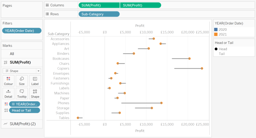
You’ve now got a dumbbell chart! Your canvas should resemble the figure below.
Step 3: Creating the Tadpoles
As mentioned before, a tadpole chart is simply a dumbbell plot with the tail cut off. But how do we create this effect?
Well, the trick is simply designating one side of the dumbbell to be the tail and the other the head, then taking advantage of transparent shapes. Transparent shapes create a data mark on the canvas with total transparency (i.e. transparent).
The Flerlage Twins have an excellent blog that covers transparent shapes and includes a download to a transparent shape image that you can load into your Tableau install. I highly recommend reading it.
- Read the Flerlage Twins “14 Use Cases for Transparent Shapes” (with transparent shape image download).
Here we go!
Our first step on the tadpole journey is to create a CALCULATED FIELD that will essentially designate one year as the ‘head’ and the other as the ‘tail. In this instance, I’m going to elect to designate 2021 as the ‘head’ and 2020 as the tail. The calculation is as follows:
HEAD OR TAIL

IF YEAR([Order Date])=2021 THEN
"Head"
ELSEIF Year([Order Date])=2020 THEN
"Tail"
END
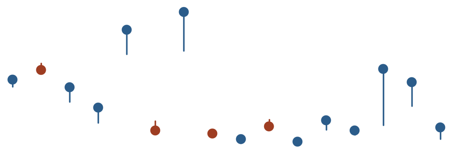
Once you’ve created this calculated field (I’ve called mine HEAD OR TAIL), change your CIRCLE mark on your chart canvas to SHAPE. Then drag the HEAD OR TAIL calculation to the SHAPE mark.
While still on your shape mark, click on the mark and open the EDIT SHAPE dialog. We need to now specify what shapes we want to use for the head and tail. I’ve chosen a CIRCLE for the head, and then I select a TRANSPARENT SHAPE for the tail. 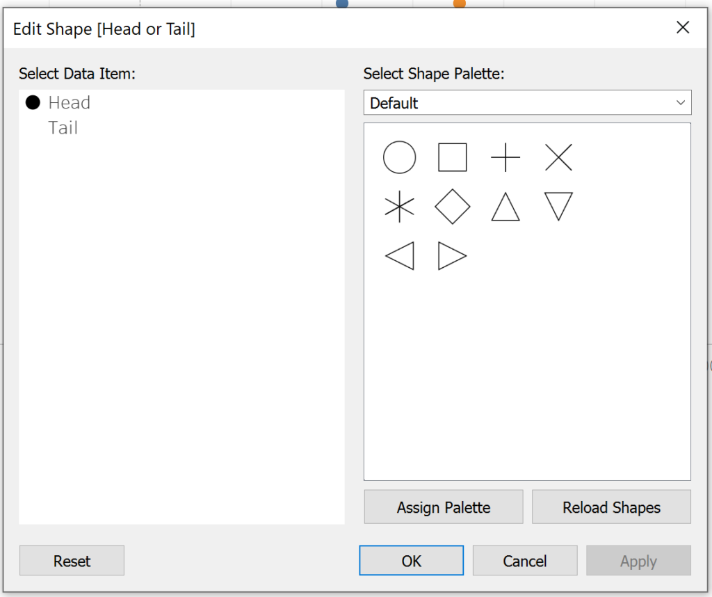
After these steps you should basically have a tadpole chart. If you’ve followed along, it should look basically like the figure below.
Our final few steps is to add some flash to the tadpole.
Step 4: Emphasising Difference Through Use of Colour
meh. How about we emphasise the change in profit by assigning one colour to a tadpole which has seen an increase in profits between 2020 and 2021, and another colour where profits decrease?
I like the sound of that. Let’s rock and roll.
In order to do this colour scheme, we must first calculate the difference between profits in 2020 and profits in 2021 by product sub-category. In this example, I use FIXED level of detail (LOD) expressions to isolate both vales at the sub-category level of granularity. Here’s the first calculation called SUB CATEGORY PROFIT 2021.
SUB CATEGORY PROFIT 2021

{FIXED [Sub-Category]: SUM(IF YEAR([Order Date])=2021 THEN
   [Profit]
END)}
Repeat the LOD calculation for the year 2020. You can duplicate your 2021 calculation then simply edit the Order Date year in the calculation and save with a useful name (e.g. Sub Category Profit 2020). I’ve called mine SUB CATEGORY PROFIT 2020 and here’s the code if you want to copy:
SUB CATEGORY PROFIT 2020

{FIXED [Sub-Category]: SUM(IF YEAR([Order Date])=2020 THEN
   [Profit]
END)}
Now that we have the two LOD calculations, we can now calculate the difference between them. However, for this exercise we only really need to know if the change is positive or negative, so we can leverage a really useful Tableau function called SIGN to evaluate whether the difference is negative or positive. Here’s the code for a calculation:
SUB CATEGORY PROFIT DIFF SIGN

SIGN([Sub Category Profit 2021]-[Sub Category Profit 2020])
If the difference is POSITIVE, the calculation will return 1, if NEGATIVE, it will return -1. We can now use this to colour our tadpoles!
Now to colour ALL your tadpoles by their direction, you can simply drag your newly created sign calculation SUB CATEGORY PROFIT DIFF SIGN to the COLOUR MARK in the ALL panel on your visualisation. Adjust your colours to what ever you want – I’ve simply used standard old blue and orange to sign postive/negative direction.
If you’ve followed these instructions, your canvas should look something like this:
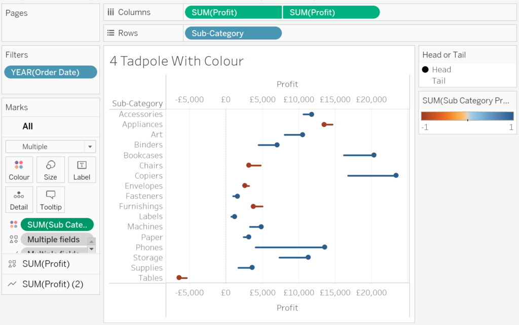
Now it’s really obvious that appliances, chairs, envelopes, furnishings and tables have seen a FALL in profit in 2021 compared to the previous year! Nice one!
Step 5: Nice Labels For Your Tadpoles But Only At Their Heads
Adding labels to your tadpoles is a tiny bit tricky. If you simply turn on labels for the SHAPES mark, it will look like this:
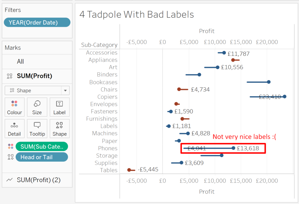
Not very nice!
However, if you turn on the labels for the LINE mark, Tableau is smart enough to place the marks correctly. It’ll look like this:
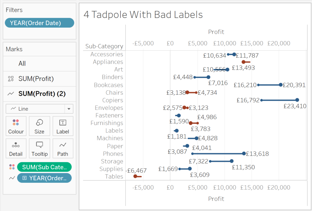
That’s nicer, but what if you simply want the tadpole head to be labelled rather than both ends? Well, that’s fairly easy – just turn your label to only show MOST RECENT.
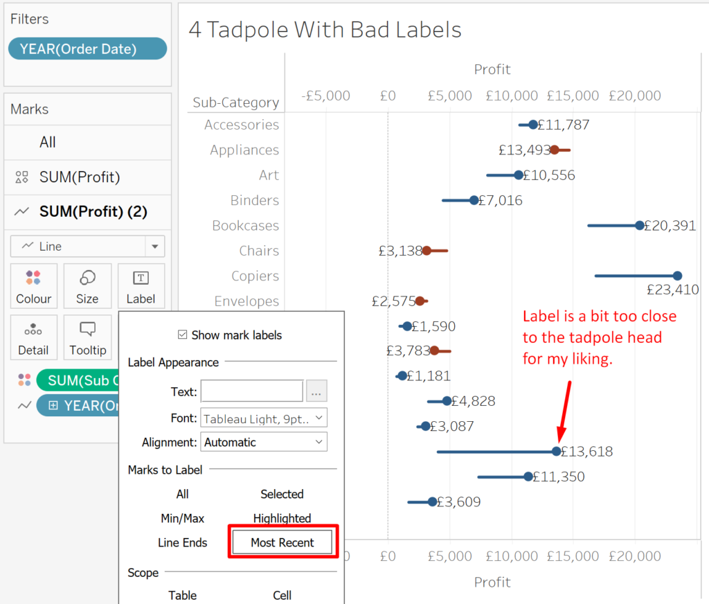
But, as you can see in the image above, I’m not a huge fan of the labels being so close to the shape mark. This is because we’re labelling the line, and Tableau doesn’t repel the labels away from other marks on the canvas.
The solution here is quite straight forward – just pad out the labels on both sides with space characters (2 or 3 ought to do it).
I have in the past seemed to come across an issue where the labels can be trimmed by Tableau (i.e. Tableau removes the space characters) and in those cases you can insert unicode to get the spaces you need.

(coincidentally, Kevin Flerlage released a video on this blank character at pretty much the same time, I recommend checking out his explanation on Youtube which explains this tweak in depth).
Anyway, inserting space on both sides of the label makes your labels all nicely padded to the marks on the canvas. You’ll have to drag the PROFIT measure to the LABELS card in the LINE mark so you can add in the space characters, but once you’ve done that, your canvas should resemble the figure below.
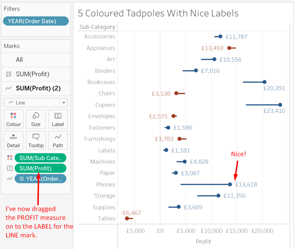
You also might have noticed that I’ve changed the label COLOUR to match the mark colour. I like the way it looks!
BONUS TIP: Giving Labels Space to Breathe Using Distribution Bands
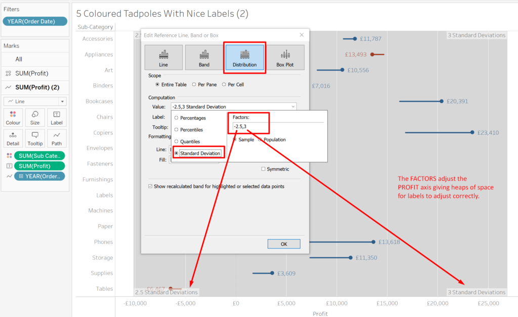
You may have noticed in the the figure above that some labels near the edge of the canvas don’t sit nicely. They’re pressed up against the axis and thus Tableau moves them to a position different to other labels. I’m sure that is fine for some people – but I’m finicky, I want my labels to breathe!
Fortunately there is a neat little hack that allows you to expand the canvas easily without having to create any new calculations and it involves using reference lines to expand the axis range.
Here’s how to do it using the tadpole chart we’ve built together.
On your tadpole chart, go to the ANALYTICS menu/pane (up near the DATA pane at the top-left usually). Drag a REFERENCE LINE on to the canvas and select TABLE as the option.
In the resultant dialog box, select DISTRIBUTION. Now we want to adjust the COMPUTATION VALUE. Select an appropriate standard deviation, in this case -2.5 and 3 works really well as you can see in the following figure.
And now suddenly you have the luxury of lots of space for your labels!
There are other options if you only have positive values – you can use percentages and adjust the band to be something like 120% of the maximum value, but this doesn’t work if you have both positive and negative values. Thus, we’ve used the standard deviation approach.
Remember to set your distribution band LINE and FILL parameters to ‘none’ so they’re invisible!
Now you can do a bit of tidying up and let your tadpoles swim free. Here’s what mine looks like at the end.
And that’s it! I hope you’ve found this tutorial useful. Of course, I’ve made this work book with each step available to download via my Tableau Public page (see link below). Thanks for following along and let me know any questions or comments via Twitter (@dbfmurray). I want to see your tadpole charts!
Link to Downloadable Workbook
You’re welcome to download the workbook linked below so you can see how it all works.
Leave a Reply
You must be logged in to post a comment.