
Tag: Connected Dot Plots
-
Down With Tadpoles, Up With Arrows | The Superiority of the Arrow Chart
So yesterday I published a blog on how to create a Tadpole Chart. And there was some great feedback and some great debate over the usability both on Twitter and on LinkedIn. However, one tweet thread with Tableau Ambassador Christina Gorga and Data Viz Wizard Steve Wexler was particularly interesting As much as I like…
-
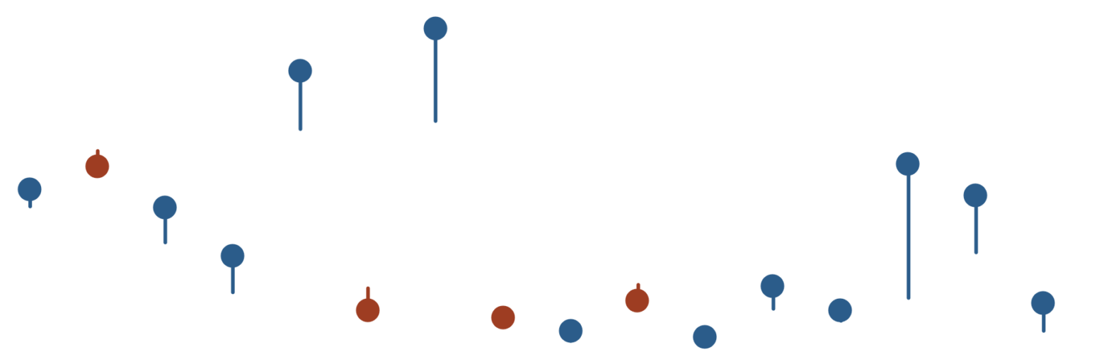
Tadpole Charts with Nicely Placed Labels in Tableau
I’m indifferent to amphibians, but I do like tadpole charts. In this blog, I’m going to show you the steps to create one with a little trick around labelling that may be useful in making this chart – but also for other charts in Tableau. Table of Contents This ones a bit involved, so here’s…