
Author: Darragh
-
The Lost Australians of Gallipoli
I’ve carved out some time from my busy schedule to throw together a new viz, this time on cause of death of Australian’s at Gallipoli during the course of the 10 month campaign. You can view the interactive on Tableau Public by clicking here. Here is some more context about the visual that I wrote…
-
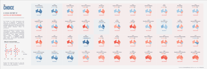
Iterative Visual Design and The Choice Visual
Early last month, I published a series of new Tableau Public visualisations on the history of referendums in Australia, immediately prior to the latest Australian referendum vote on recognising Indigenous Australians in our constitution – commonly known as the referendum on The Voice to parliament (unfortunately, the vote failed but I’m not going to delve…
-
Tableau Tip: A Method to Remove Flashing Border around Text Marks
You should know by now that I think Tableau is a super great product, but it does have its little idiosyncrasies that can cause a slight bit of frustration. Fortunately, in most cases there is usually a way simple way around these quirks but often this knowledge can be difficult to access or locate. One…
-
Tableau Ironviz 2023 Qualifiers: Top 3 in Asia-Pacific & Top 15 Overall!
What an end to the year! I found out early this morning that I placed in the top 15 and third in the Asia-Pacific region in Tableau’s annual Iron Viz competition for my interactive visual essay on the evolution of the AFLW “The Blazing of the Trail“. Link to announcement from Tableau. If you weren’t…
-
Reflections on Iron Viz 2023 Feeder Round & Three Lessons Learned
My first participation in Iron Viz Qualifier was a surreal experience. As I hit the submit button with 10 minutes left until the submission deadline, I felt both wrung out and exhilarated. Like someone had squeezed champagne out of a tea towel. Bizarre metaphors aside, Iron Viz was an odyssey but still an overwhelmingly positive…