
Early last month, I published a series of new Tableau Public visualisations on the history of referendums in Australia, immediately prior to the latest Australian referendum vote on recognising Indigenous Australians in our constitution – commonly known as the referendum on The Voice to parliament (unfortunately, the vote failed but I’m not going to delve into the politics of that outcome here).
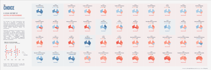
As I developed this series, I iterated through a few design approaches before settling on a horizontally scrolling visualisation. This version, shown below, incorporates some design in Figma (contextual text and fonts) and the rest completed in Tableau, predominantly in .
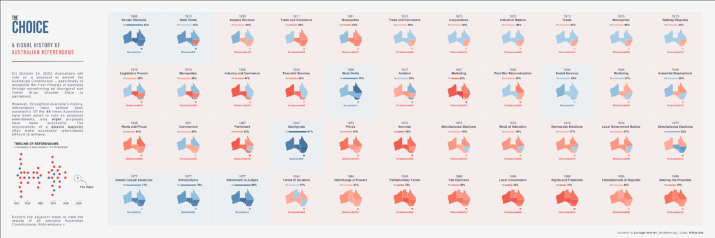
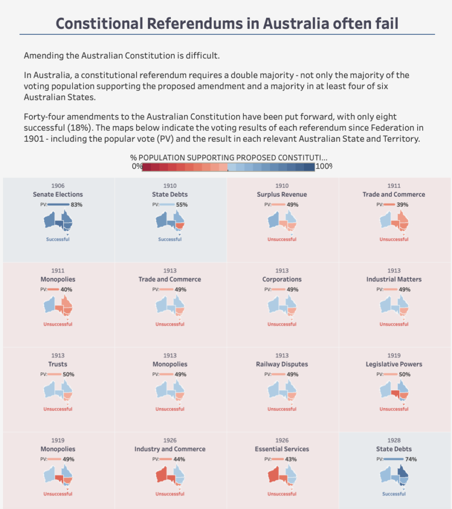
The small multiple maps with bar charts were developed all in Tableau using map layers – a hugely underrated feature of the product that can be extremely powerful. Here’s an image of the final version:
Alternatively you can go visit the final interactive version on Tableau Public itself.
Quick insights into the story behind this viz
I consider myself pretty informed when it comes to Australian political history. I know how referendums in Australia work, specifically that you need a popular majority and a majority in at least four Australian States in order for the proposed constitutional amendment to be successful.
What I didn’t realise that so many had been unsuccessful.
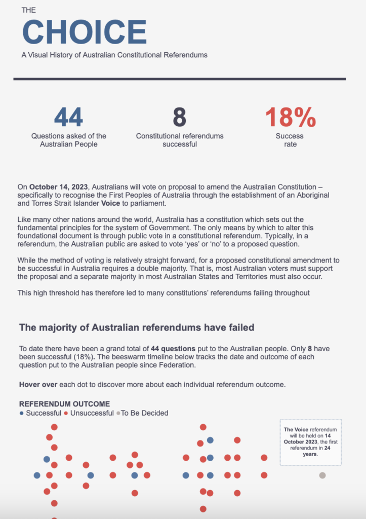
In fact, we’ve only had 8 proposed amendments succeed out of 44. That’s an 18% success rate. You’d have to think the stats were stacked against The Voice referendum from the outset.
Also it was quite interesting to learn that a number of referendums have been unsuccessful despite achieving a popular majority across Australia. These events have occurred in 1946, 1977 and 1984.
It was also quite interesting to find out that the 1967 vote on amending the constitution to grant the federal government to make laws on behalf of Indigenous Australians was the most successful referendum ever.
As I reflect on these insights, it once agains confirms my belief that data visualisation is of huge benefit for learning historical events quickly.
Why did I make changes to my visualisation?
I also did a few versions of this and you can see the previous versions to see how the design evolved.
Now I could have just deleted these old versions and just kept the newer versions up, but I’ve decided to keep the older versions as a learning experience.
Version 1
With version 1, I defaulted to my usual ‘scrollytelling’ design. This was a vertically formatted visualisation with BANs, a beeswarm timeline and then 44 small multiple maps created using map layers. The visual itself was 2000 x 5000 pixels in dimensions – a bit of a slog to be honest!
At first, I was pretty happy with the design, but progressively lost passion for this form. I felt it was way too wordy and took too long to get to the visual content – which was the selling point. It was also way too ‘big’ to effectively share on social media channels.
One real issue was the formatting on text boxes. I was using a slightly older version of Tableau Desktop and after I uploaded the visuals to Tableau Public, the positioning of the text boxes and the size of the text differed when on the Tableau Public server. There seemed to be an issue with Arial font, in particular.
It was very frustrating and I wasn’t happy, but felt it was ‘good enough’ to get out in the world. However, I would soon return to the project when I realised it was hard to share on LinkedIn. Hence, version 2.
Version 2
I developed version 2 primarily as an easier way for the graphic to be shared on social media. As I mentioned previously, the first visual was too ‘scrollytelling’ for it to be easily digested.
I cut the visual down to simply the maps alone and edited down the background text. This meant people could consume most of the visual easily without reading a lot of text.
The move somewhat paid off as I posted the graphic to both /r/australia and /r/dataisbeautiful and it reached almost half a million views!
Still, I wasn’t 100% happy. Tableau map guru Dennis Kao provided some very helpful feedback about trying to find a way to highlight the successful referendum maps and I jumped on this feedback and resolved to re-tool the design with a colour background ’tile’ to indicate this fact.
A few more hours stuffing around in Tableau and Figma, and I settled on the final version.
Final version
As you’re aware, there were aspects with the design that I was not happy with – particularly of all the bone-headed error in the title of the 1967 referendum. But one issue that bothered me in both version 1 and 2 of the visual was the fonts!
So why not build yet another version?
Tableau, while a brilliant visual maker, doesn’t really give you much flexibility when it comes to fonts. Which is a real shame because it prevents you from doing some cool stuff.
Hence, I designed a new background with text in Figma. This method allowed me to make a ‘nicer’ logo with the word ‘the’ closer to the ‘Choice’ heading as Figma allows you to modify the line spacing.
This ability is absent in Tableau and it’s a real shame because it means people have to rely on external platforms in order to add some design elements into the the text in their visualisations. This also gives rise to accessibility issues as people are incentivised to embed these fonts within images, which will not be accessible by default.
I also made the choice to shrink the beeswarm timeline and then create an 11×4 grid that scrolled horizontally rather than vertically. As someone on Twitter mentioned, this made it easier to read the background context while also viewing the visual.
And in the end, thats the version I settled on!
….So what is the point of this post?
Other than feeling an itch to blog about my design process and explain why I built three different versions of the essentially the same thing, I thought people might like to get an insight into how data visualisation designers think critically about design choices. That’s pretty much it. If you’ve made it this far, I hope you’ve got something out of it!
Leave a Reply
You must be logged in to post a comment.