
Category: Tableau Tip
-
Tableau Tip: A Method to Remove Flashing Border around Text Marks
You should know by now that I think Tableau is a super great product, but it does have its little idiosyncrasies that can cause a slight bit of frustration. Fortunately, in most cases there is usually a way simple way around these quirks but often this knowledge can be difficult to access or locate. One…
-
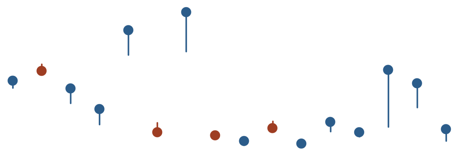
Down With Tadpoles, Up With Arrows | The Superiority of the Arrow Chart
So yesterday I published a blog on how to create a Tadpole Chart. And there was some great feedback and some great debate over the usability both on Twitter and on LinkedIn. However, one tweet thread with Tableau Ambassador Christina Gorga and Data Viz Wizard Steve Wexler was particularly interesting As much as I like…
-
Tadpole Charts with Nicely Placed Labels in Tableau
I’m indifferent to amphibians, but I do like tadpole charts. In this blog, I’m going to show you the steps to create one with a little trick around labelling that may be useful in making this chart – but also for other charts in Tableau. Table of Contents This ones a bit involved, so here’s…
-
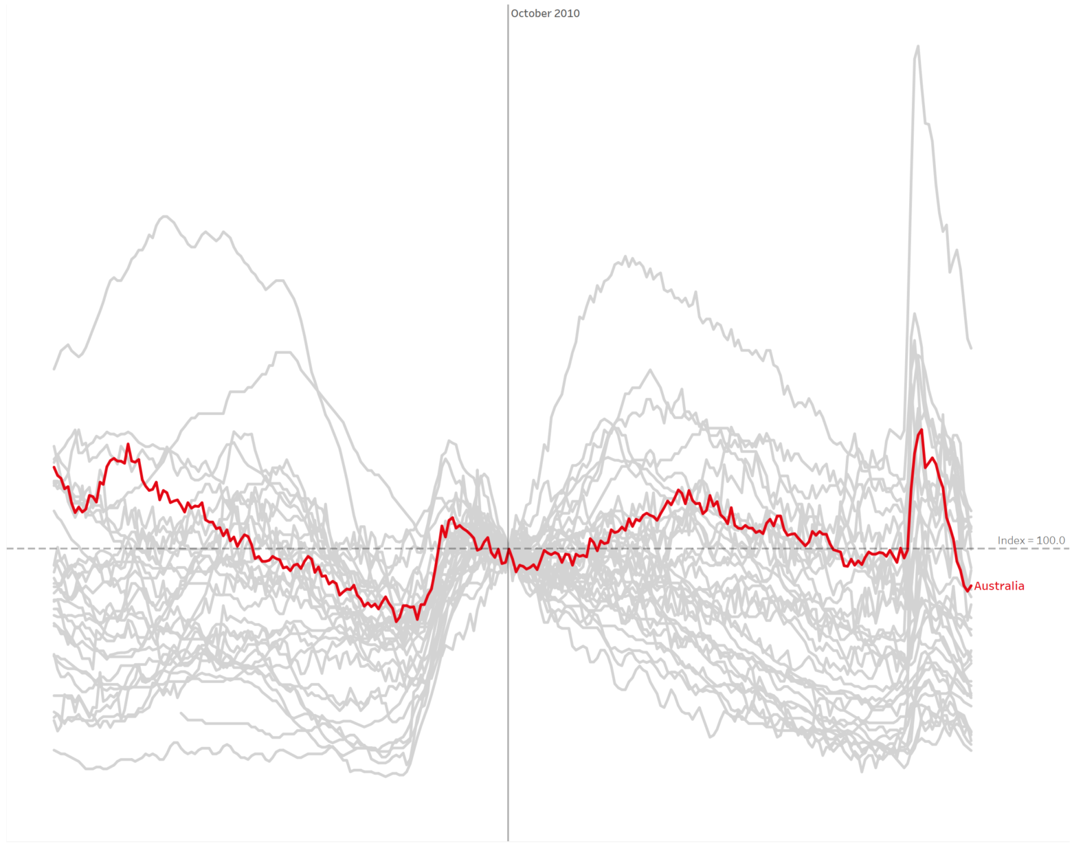
How to build and interpret an index chart using Tableau
The index chart is a chart type that often comes in extremely useful for analysing the change in time series data. You’ve probably seen these charts frequently used in finance – such as tracking a financial index like the S&P500. Here’s an example pulled from Statista looking at US Stock Indices since the start of…
-

Using a parameter to filter for specific records in a Tableau dashboard or worksheet
Filters are great and all, but I genuinely love Tableau parameters. One technique that I frequently use for certain dashboard designs is using a parameter as the primary method of interaction. That is, I use parameters to take input from users, which primarily drives the data viewed on screen. The parameter filters worksheets and shows…