
So yesterday I published a blog on how to create a Tadpole Chart. And there was some great feedback and some great debate over the usability both on Twitter and on LinkedIn.
However, one tweet thread with Tableau Ambassador Christina Gorga and Data Viz Wizard Steve Wexler was particularly interesting
As much as I like the aesthetic appeal of the comet and tadpole, an arrow chart is now my first choice. The comet doesn’t work well if the two values are close together.
— Steve Wexler (@DataRevelations) October 3, 2022
After reading this, I felt somewhat foolish.
Another commenter on LinkedIn made the insightful observation that the circle marks of the tadpole chart also didn’t make clear if it was the start or end of the line. To do so might have necessitated a legend and me – being a person who likes to strip out as much unnecessary layers of information as possible – didn’t really want to put in a legend.
Taking this all in, an arrow chart makes far more sense than the circle marks of the tadpole. I’m now annoyed I didn’t write my tutorial on that first!
Steve actually discusses this in his latest book The Big Picture which I now should probably go read.
Anyway, I wanted to set the record straight and declare publicly my loyalty to the superior arrow chart and also update my tweak my tadpole chart tutorial to show you how to make an arrow chart using the same data set as my initial blog. Turns out the process is nearly identical but there are a few little tweaks in step 3.
Basically follow all the instructions from the previous post, but swap out step 3 with new instructions below.
Set Up For Arrows!
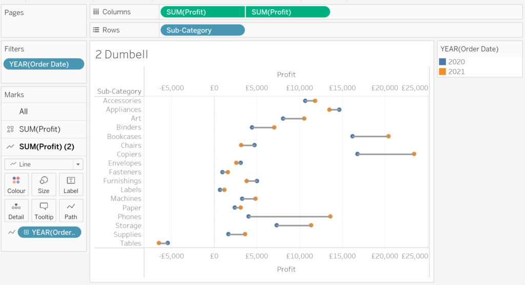
So if you’ve gone back and followed the instructions (as I’ve mentioned a few times 😂), you canvas should look like the following:
The process of turning them into arrows is fairly straight forward, though requires to create a few calculations.
Like in the tadpole chart tutorial, we need to first calculate the difference between profits in 2020 and profits in 2021 by product sub-category. In this example, I use FIXED level of detail (LOD) expressions to isolate both vales at the sub-category level of granularity. Here’s the first calculation called SUB CATEGORY PROFIT 2021.
SUB CATEGORY PROFIT 2021

{FIXED [Sub-Category]: SUM(IF YEAR([Order Date])=2021 THEN
   [Profit]
END)}
Repeat the LOD calculation for the year 2020. You can duplicate your 2021 calculation then simply edit the Order Date year in the calculation and save with a useful name (e.g. Sub Category Profit 2020). I’ve called mine SUB CATEGORY PROFIT 2020 and here’s the code if you want to copy:
SUB CATEGORY PROFIT 2020

{FIXED [Sub-Category]: SUM(IF YEAR([Order Date])=2020 THEN
   [Profit]
END)}
Now that we have the two LOD calculations, we can now calculate the difference between them. However, for this exercise we only really need to know if the change is positive or negative, so we can leverage a really useful Tableau function called SIGN to evaluate whether the difference is negative or positive. Here’s the code:
SUB CATEGORY PROFIT DIFF SIGN

SIGN([Sub Category Profit 2021]-[Sub Category Profit 2020])
If the difference is POSITIVE, the calculation will return 1, if NEGATIVE, it will return -1. We can now use this to colour our arrows as well as tell Tableau where to put the arrow heads! A negative value will mean our arrows should go to the left, while positive heads to the right.
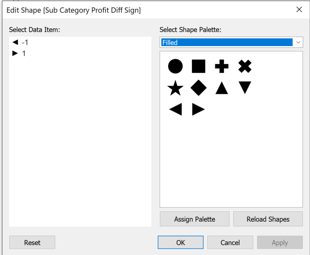
We now can use that last calculation to build our arrow heads. Change the profit pill that is currently set to circle to SHAPE. Then drag the new calculation SUB CATEGORY PROFIT DIFF SIGN on to the shape card.
Creating the Arrow Heads
All right, you’ve got your LODs and SIGN calculation set, and your marks mostly set up – it’s now time to turn those circles into arrows. Click on the shape card of your shape mark. On the following dialog, you want to select FILLED SHAPES from the shape palette. Then you want to select a left-facing triangle for those values where SUB CATEGORY PROFIT SIGN is -1 and a right-facing triangle for when the calculation is +1.
The figure below shows you the correct setup.
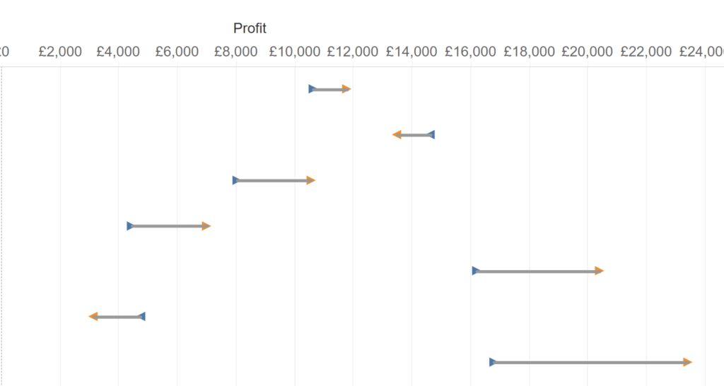
Hit OK, and you’ll be well on your way. But, you’ll quickly notice this quirk – the arrow heads are at the end of BOTH lines. What gives?
Well, there is a very easy way around this – and it involves another calculation that manipulates the size of the arrow head. Create a new calculated field with the following code:
ARROW SIZE

IF year([Order Date])=2021 THEN
   1
ELSE
   0
END
What we’re going to use this for is to tell Tableau to set the most recent value (2021) to size of 1, and all other values to 0.
We then place this calculation on the SIZE card of the SHAPE mark. And when you do that, things will look better…but still not quite right. The arrow heads will have the triangles in the right place, but they’ll be of variable sizes. That’s due to the AGGREGATION on the arrow size calculated field.
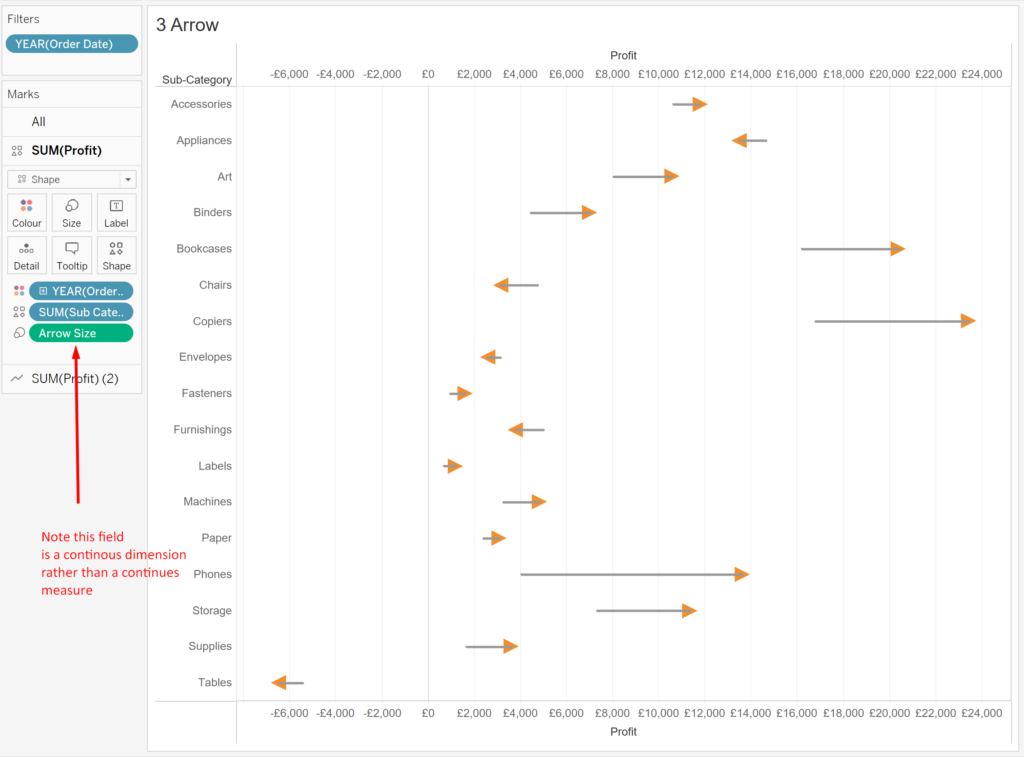
You simply change it to a dimension on the size mark, and all will be right in the world. By now, you should see something like this:
Ok, So Arrows Have Arrived, What Next?
Ok, so you’ve got the bones of the arrow chart done. If you want it to look nice and pretty, your next steps are basically the same as the Step 4 onward in the Tadpole Chart tutorial. So rather than me write it all out again, I’m going to link you directly there – just click here!.
Just replace all references to tadpole with references to arrows as you read through 😃 Note: there is some double up in instructions, you will have already created the LODs in the steps above but I trust you’re clever enough to not repeat?
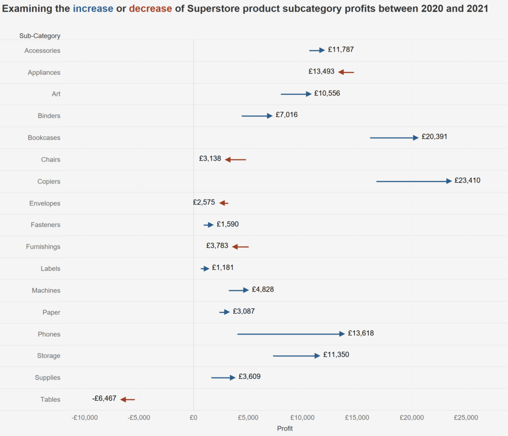
Once you’re done, you should have something like the following:
TLDR! Just Give Me The Link To The Workbook!
Yes sir! I have made this modified tutorial also available as a workbook on my Tableau Public page.
Just click this link to access and download and you can reverse engineer the steps!
Hope you’ve enjoyed this update to the Tadpole Chart!
Leave a Reply
You must be logged in to post a comment.