
Tag: data visualisation
-
Tableau Ironviz 2023 Qualifiers: Top 3 in Asia-Pacific & Top 15 Overall!
What an end to the year! I found out early this morning that I placed in the top 15 and third in the Asia-Pacific region in Tableau’s annual Iron Viz competition for my interactive visual essay on the evolution of the AFLW “The Blazing of the Trail“. Link to announcement from Tableau. If you weren’t…
-
Down With Tadpoles, Up With Arrows | The Superiority of the Arrow Chart
So yesterday I published a blog on how to create a Tadpole Chart. And there was some great feedback and some great debate over the usability both on Twitter and on LinkedIn. However, one tweet thread with Tableau Ambassador Christina Gorga and Data Viz Wizard Steve Wexler was particularly interesting As much as I like…
-
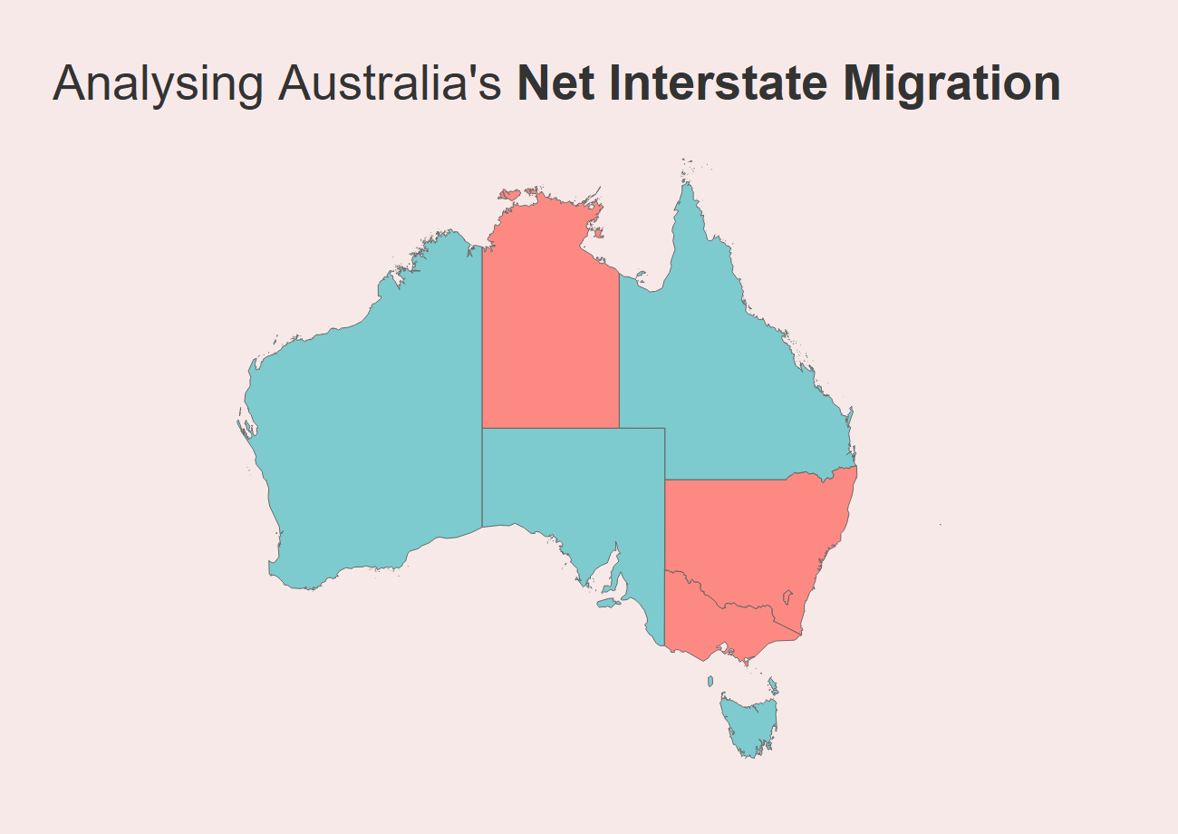
Analysing Interstate Migration Movements in Australia
I recently published a dashboard to allow people to view Australian interstate migration figures using ABS data. As I mentioned in the post introducing the dashboard (which you can read here), interstate migration became a hot topic throughout the first two years of the COVID-19 pandemic. We witnessed en-masse movements of Australians throughout the country…
-
Visualising Population | Australian Interstate Migration Figures
I’m a migrant, and migration data has always fascinated me. While the media focus is often on international migration to Australia, the COVID pandemic suddenly threw interstate migration into sharp focus, as lockdowns in various states may have incentivised different people to question where they lived and what type of life they wanted to live. And as…
-
The importance of exploratory data analysis: Exploring the first B2VB challenge
I kicked off the year participating in a brand-new data visualisation curated by Eric Balash. It’s called ‘Back to Viz Basics’, also known by its hashtag #B2VB. It’s a fortnightly challenge where the data visualisation community – both new and old – come together to practice some core charting skills. You can read about the initiative…
-
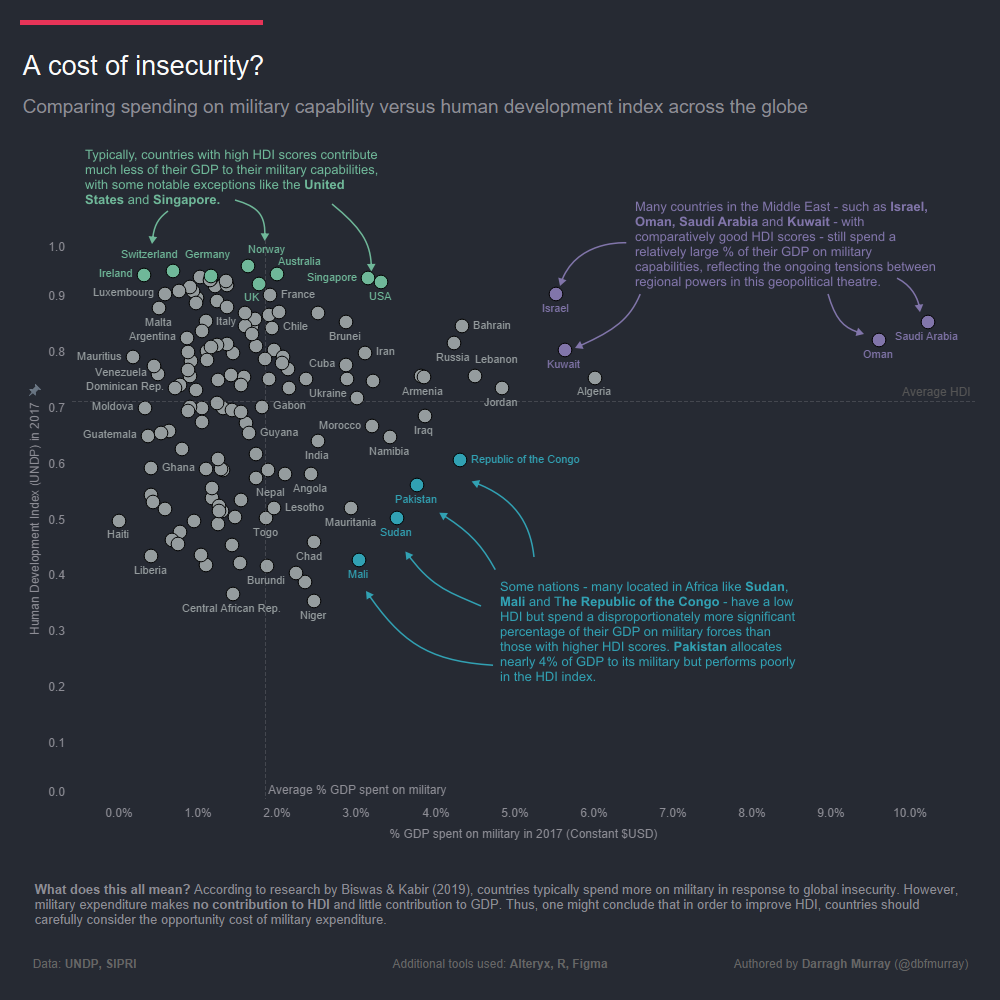
A Cost of Insecurity – Comparing Spending on Military Capability v the Human Development Index
One great thing about the company I work for is that they continually encourage us to develop our skills via monthly data visualisation challenges. The latest challenge was themed on ‘scatter plots’ and it was definitely one I wished to be a part of – I love scatter plots! Harking back to my postgraduate studies…