
I’m a migrant, and migration data has always fascinated me.
While the media focus is often on international migration to Australia, the COVID pandemic suddenly threw interstate migration into sharp focus, as lockdowns in various states may have incentivised different people to question where they lived and what type of life they wanted to live.
And as someone who was in the Queensland real estate market in 2021, it was often common to read stories about how people fleeing the lockdowns in southern Australian States and Territories were adding a lot of demand to a piping hot housing market.
As a result, I’ve been interested in seeing the flow of people in and out of Australia’s various States and Territories.
The Australian Bureau of Statistics (ABS) publishes helpful information on people’s movements within Australia. However, it’s often spread out amongst several different web pages and not in a dynamic, customisable form that allows you to get answers quickly.
As a result, I’ve thrown together a small dashboard that hopefully allows people to analyse interstate migration quickly.
You can access the dashboard via Tableau Public by clicking here: Australian Interstate Migration.
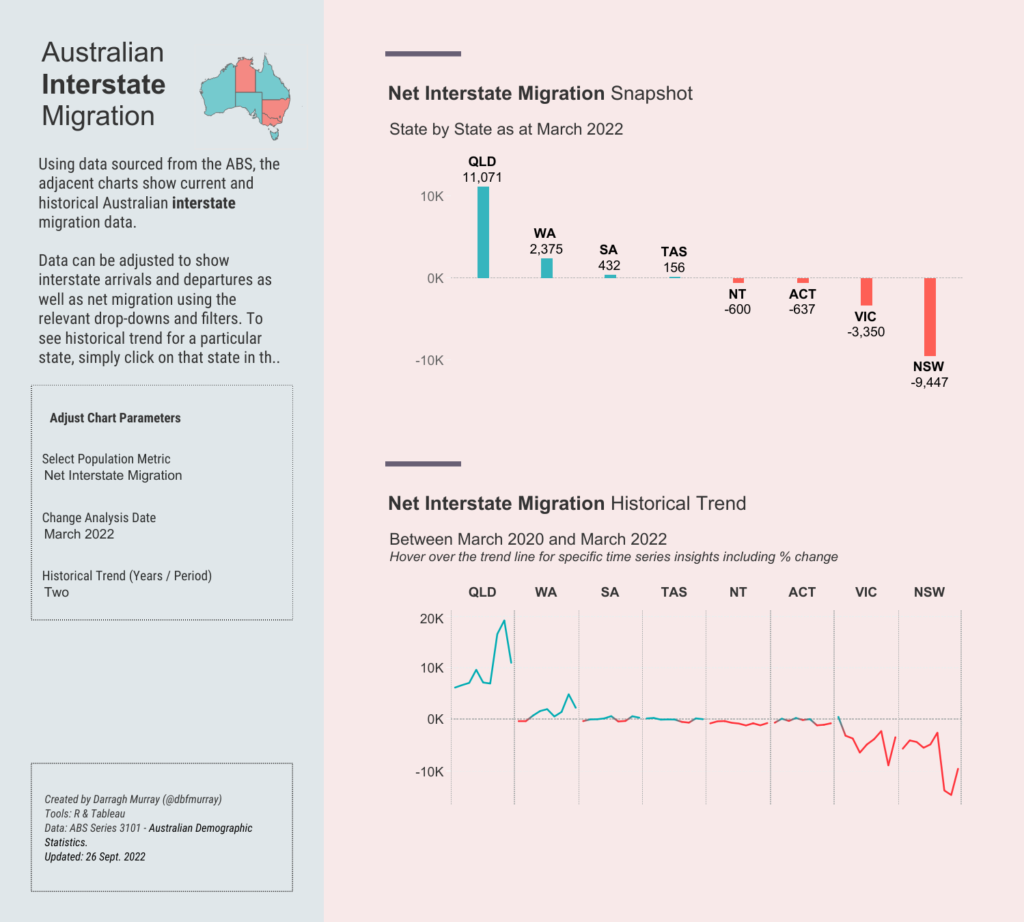
Here’s what the dashboard looks like:
Some quick instructions
There are two sections. On the right are two simple charts, and on the left are some parameters used to manipulate the data in the charts.
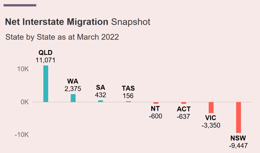
The top-left chart shows snapshot data at a specific moment. Typically this chart defaults to measuring Net Interstate Migration at (or up to) the latest available snapshot date by Australian State/Territory.
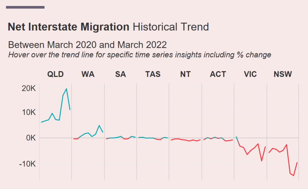
The bottom-right chart shows the Australian State/Territory trend for the selected metric by whatever historical trend parameter has been chosen (defaults to two).
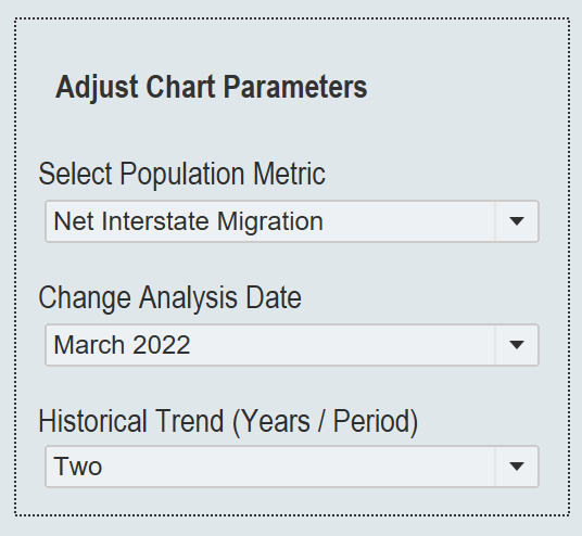
On the far left is an area to adjust the parameters of the two charts – these include a population metric dimension (arrivals, departures, net migration) and an analysis date dimension – the latter allowing you to example data at available quarterly intervals going back to June 1981.
The final available parameter is a historical trend (years/period) selector, allowing you to adjust the historical trend chart to suit your needs. Typically the parameter takes some predefined year intervals – but also has one that shows the COVID pandemic period (March 2020 onward). This trend also relies on the analysis date parameter to determine where the trend ends.
So, for example, if you wanted to see the state-by-state net interstate migration figures for the decade up to December 2000, you would set the following parameters.
Select Population Metric = Net Interstate Migration
Change Analysis Date = December 2000
Historical Trend (Years/Periods) = 10
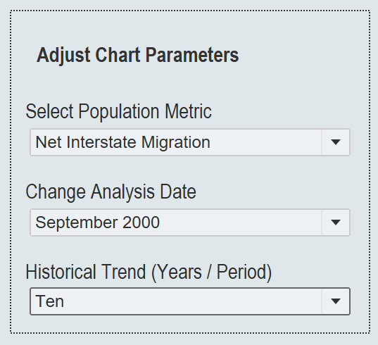
You would end up with a figure like the following:
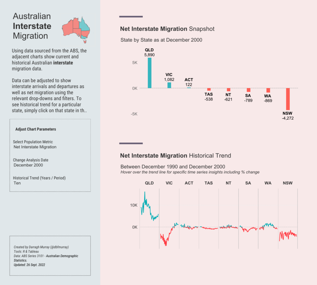
And voila!
Hopefully, it’s a valuable tool that makes using the ABS data even more straightforward.
I’ll keep it up to date and add other population metrics to it over time. Any issues or questions or suggestions, please send me a message via Twitter at @dbfmurray.
Leave a Reply
You must be logged in to post a comment.