
Tag: Tutorial
-
Down With Tadpoles, Up With Arrows | The Superiority of the Arrow Chart
So yesterday I published a blog on how to create a Tadpole Chart. And there was some great feedback and some great debate over the usability both on Twitter and on LinkedIn. However, one tweet thread with Tableau Ambassador Christina Gorga and Data Viz Wizard Steve Wexler was particularly interesting As much as I like…
-
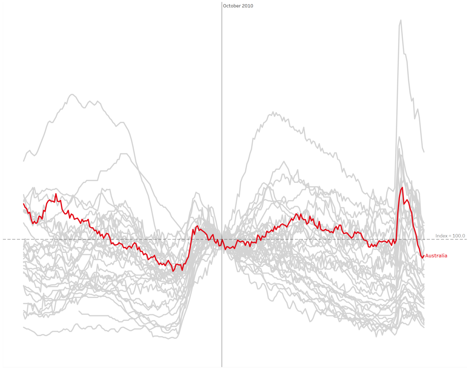
How to build and interpret an index chart using Tableau
The index chart is a chart type that often comes in extremely useful for analysing the change in time series data. You’ve probably seen these charts frequently used in finance – such as tracking a financial index like the S&P500. Here’s an example pulled from Statista looking at US Stock Indices since the start of…