
A trifecta of MakeOverMondays complete! This time I went back to the bar for a visual essay examining country wealth. The dataset showed 2019 wealth values per country and was visualised by Credit Suisse like so:
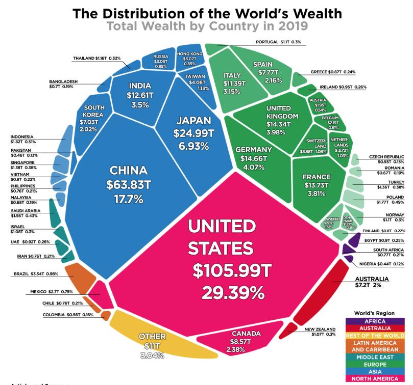
Which is actually a pretty inviting visual just on its own, though proves to be difficult to interpret if you’re interested in small countries.
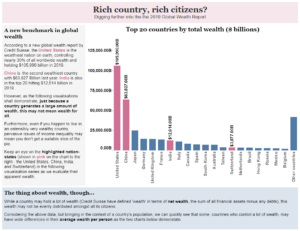
After some playing around, I mixed in some population data and began to look at it from the point of view of a citizen. Does living in a rich country mean you might be rich? I then brought in data around Gini Coefficients to inform the viewer about income inequality (something I wasn’t totally familiar with before – so I definitely learned something new).
The result was a four bar chart visual essay. Lots of text – maybe too much, but I don’t mind it that much. You can view the interactive version on Tableau Public but I’ve thrown a quick screen shot below.
Leave a Reply
You must be logged in to post a comment.