
Tag: Visualisation
-
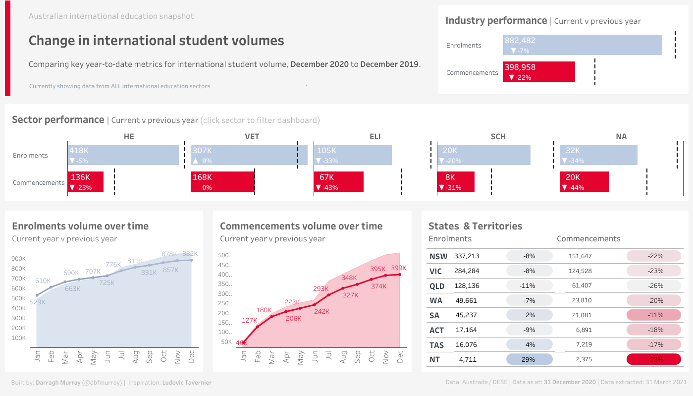
An updated Australian international education snapshot dashboard
I finally got around to updating my Australian international education snapshot dashboard. The original one, while I think was somewhat novel at the time, suffered from a fair few design flaws. Also, it didn’t render very well on Tableau Public. Since I originally did that viz, I’ve come quite some way in my Tableau abilities.…
-
Presentation at Brisbane Tableau User group
I presented at September 2020 Brisbane Tableau User Group alongside Mark Jeffrey from Griffith University and Ronak Mathur, the President of QUT Business Analysis and Data Science Club. I presented some of the background to the visualisation I presented at the Virtual Refugee Conference in June 2020. Thanks to Frederic Fery and Key Data for…
-
#MakeoverMonday 2020 Week 23: Animal-free product consumption in Great Britain
Given that I’m a vegetarian, this week’s #MakeoverMonday was particularly relevant. We were asked to visualise some data regarding animal-free consumption in Great Britain. Here’s my effort, actually done in an hour for once! Click on the image below to see the interactive (or click here). The original visualisation The original visualisation is below. There…
-
Leave our Bond alone? | #MakeOverMonday 2020 Week 5
So I finally managed to grab some free time to contribute something to the MakeOverMonday social data project. I’ve been a fan for many years and have often wanted to contribute – and finally I’ve done something that I’m relatively happy with. This is my data story analysing potential attitudes to changes in the James…
-
Tableau tricks: Adding colour to geomaps by continent or region
Tableau is a great tool for data visualisation. One major selling point of the product is its excellent mapping tools which make building visualisation fun and interpreting data a hell of a lot easier than in a flat table. Recently, I was attempting to replicate a neat visualisation I saw on the Guardian’s data blog.…