
Tableau is a great tool for data visualisation. One major selling point of the product is its excellent mapping tools which make building visualisation fun and interpreting data a hell of a lot easier than in a flat table.
Recently, I was attempting to replicate a neat visualisation I saw on the Guardian’s data blog. Simply put, I wanted to measure some data by country but colour code the data by region as well. A trip through Tableau’s detailed online help and forums only turned up solutions that were either way too complicated or not quite suited to what I was chasing.
Essentially, I just wanted to map a variable by country and then colour those variables by the continent or region the country belong to. So, for example, all data points that represented a country in Asia got a particular colour, whereas any data points in the Americas got a different colour again.
I’ll freely admit that my skills in Tableau are developing. I spent about a day researching the issue until I stumbled across obvious help in the Tableau mapping tutorial. The dominoes began falling in my head around the 13 minute mark of this Tableau help video and I could complete my task.
The solution is remarkably easy.
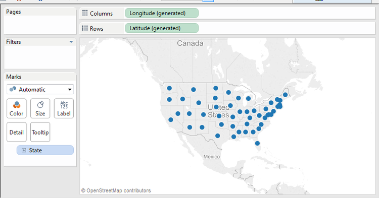
First bring across the variable you want to measure in Tableau on a geomap. Using Tableau’s example Superstore dataset, I’ve brought the state variable across into the main view.
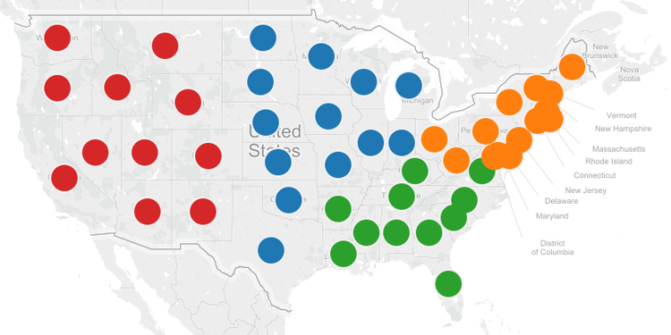
Second, you just need to simply need to drag across the variable you want to colour by. Using the same Superstore example, I’ll drag region on to the colour mark.
Now, you should see the different regions of the United States distinguished by different colours.
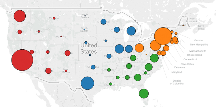
From there, you can then do all sorts of fun things like adjust the size of the bubbles by other variables. I just have to move the appropriate variable from the data pane on to the size option in the marks pain.
Here’s me using the sales variable to control the size of the circles above (also I’ve put a border on the circles for aesthetic reasons).
Now, to do this in terms of global data, you simply need a way to link countries with regions. If you have a dataset with a variable like countries, all you need to do is map those countries to a region and include that data in your Tableau project. This can easily be done using a standard UN country/region dataset.
Philip Burger has handily made one suitable for Tableau available via his website (nice one Phil!).
Importing the dataset into my Tableau project means I can link it up with my source data and begin the process of making a cool looking geomap visualisation similar to the one used in The Guardian example above.
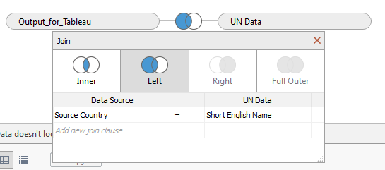
Linking my tableau output data to the UN data set based on country. I’ve used a LEFT JOIN meaning all data in my source table is outputted and only matching country names are returned in the UN dataset.
And voila, by using the technique above, I can make nice looking geographical maps like the image below.
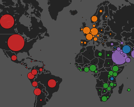
Pretty neat, huh?
Leave a Reply
You must be logged in to post a comment.