Tag: Tableau
-
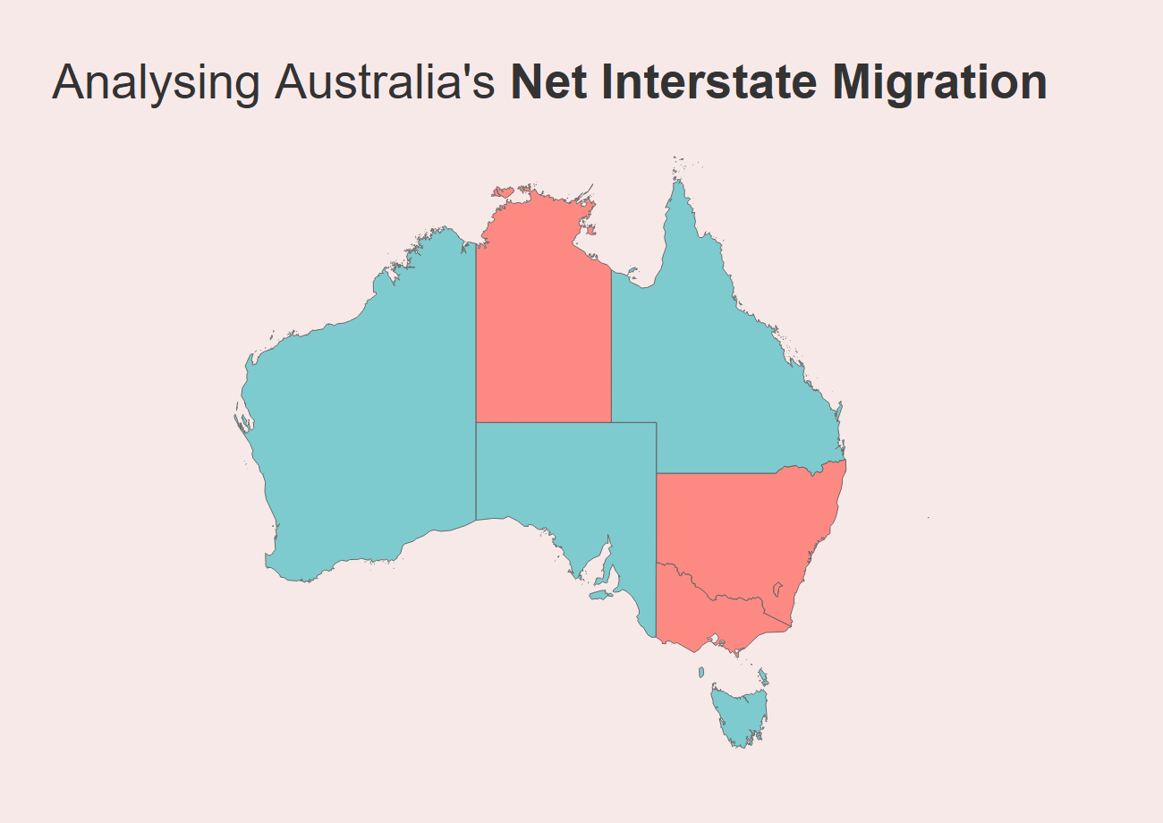
Analysing Interstate Migration Movements in Australia
I recently published a dashboard to allow people to view Australian interstate migration figures using ABS data. As I mentioned in the post introducing the dashboard (which you can read here), interstate migration became a hot topic throughout the first two years of the COVID-19 pandemic. We witnessed en-masse movements of Australians throughout the country…
-
Visualising Population | Australian Interstate Migration Figures
I’m a migrant, and migration data has always fascinated me. While the media focus is often on international migration to Australia, the COVID pandemic suddenly threw interstate migration into sharp focus, as lockdowns in various states may have incentivised different people to question where they lived and what type of life they wanted to live. And as…
-
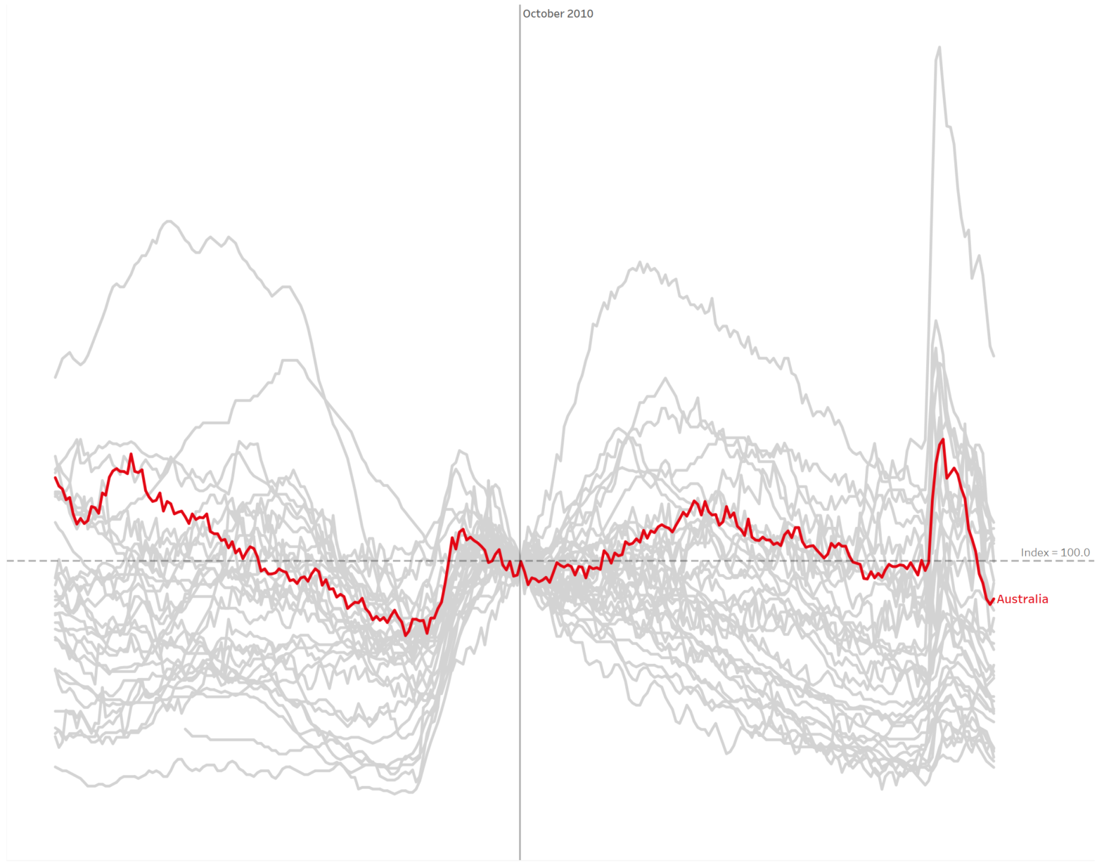
How to build and interpret an index chart using Tableau
The index chart is a chart type that often comes in extremely useful for analysing the change in time series data. You’ve probably seen these charts frequently used in finance – such as tracking a financial index like the S&P500. Here’s an example pulled from Statista looking at US Stock Indices since the start of…
-

Using a parameter to filter for specific records in a Tableau dashboard or worksheet
Filters are great and all, but I genuinely love Tableau parameters. One technique that I frequently use for certain dashboard designs is using a parameter as the primary method of interaction. That is, I use parameters to take input from users, which primarily drives the data viewed on screen. The parameter filters worksheets and shows…
-
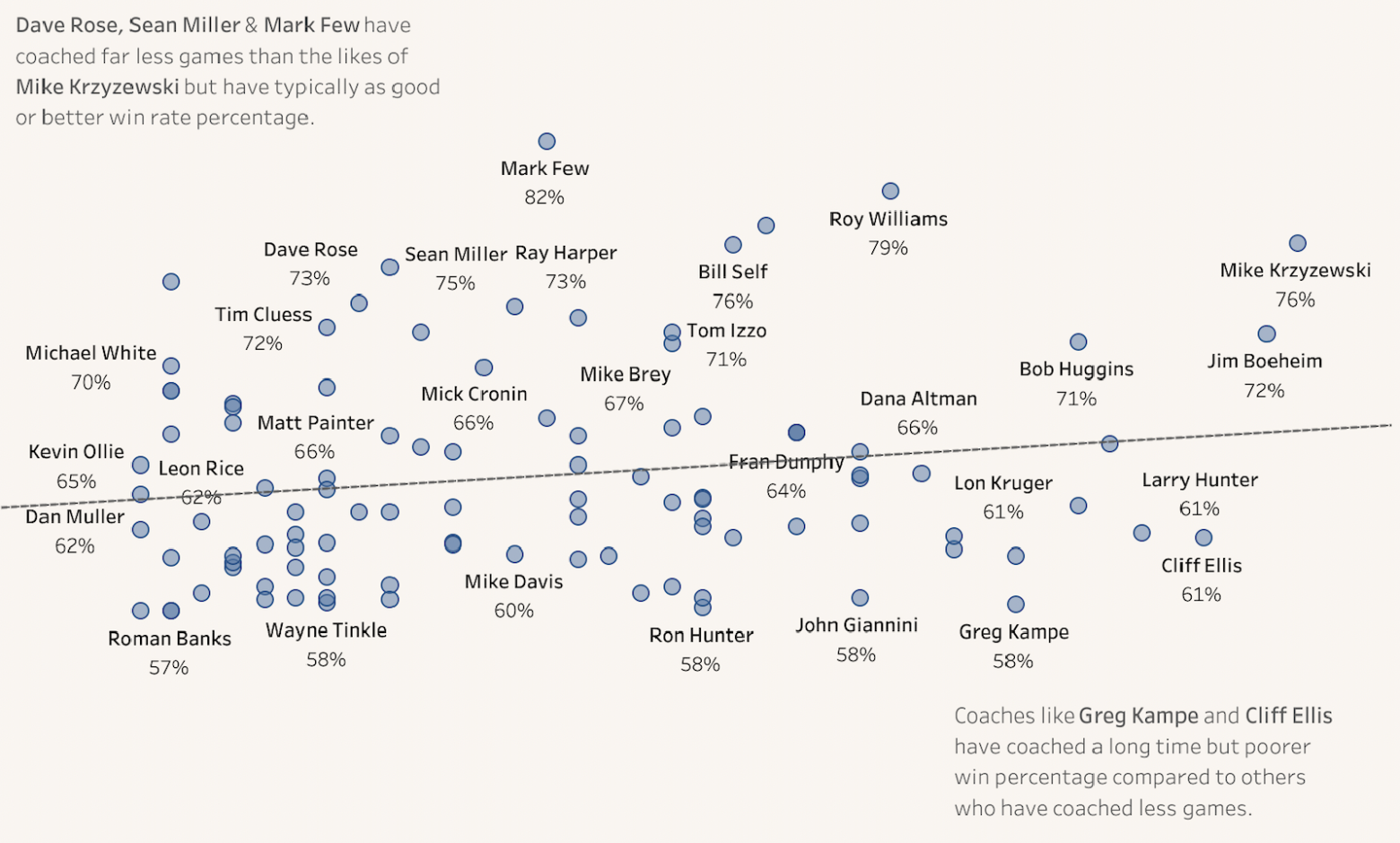
The importance of exploratory data analysis: Exploring the first B2VB challenge
I kicked off the year participating in a brand-new data visualisation curated by Eric Balash. It’s called ‘Back to Viz Basics’, also known by its hashtag #B2VB. It’s a fortnightly challenge where the data visualisation community – both new and old – come together to practice some core charting skills. You can read about the initiative…
-
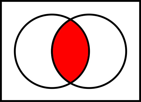
Fun with sets: Highlighting/filtering data using a shared attribute of a selected value in Tableau
Have you ever wanted to be able to filter or highlight records in a Tableau visualisation that share a common attribute? For example, say you had a visualisation and a filter that listed animals. You select ‘kangaroo’, and the visualisation would filter for ‘kangaroo’ and all other marsupials – animals that share the same infraclass…
