
Have you ever wanted to be able to filter or highlight records in a Tableau visualisation that share a common attribute? For example, say you had a visualisation and a filter that listed animals. You select ‘kangaroo’, and the visualisation would filter for ‘kangaroo’ and all other marsupials – animals that share the same infraclass as the chosen ‘kangaroo’.
Typically, when filtering in Tableau, you filter on a single dimension or measure and the filter action is limited to whatever you selected. Using the example above, if I chose ‘kangaroo’, the visualisation would filter for kangaroos but no other, unless I chose the other marsupials manually.
Recently I was required to dynamically filter a worksheet based on a shared attribute of a selected dimension. That is – if I chose a particular dimension value, the view would filter based on a shared feature of the specified value. Filtering or highlighting based on shared attributes turns out to be an excellent use case for a set.
This post shows you how to achieve dynamic filtering or visualisation based on shared attributes using a straightforward set and a few calculated fields. Let me explain in more detail using one of Tableau’s default datasets, World Indicators.
If you’re unfamiliar with what sets are in Tableau, I implore you first to read the following links:
A problem statement: highlighting countries on the same continent as a selected country.
In this example, this is the following problem statement I’m going to solve using combined sets:
When I select a particular country, the visual will highlight that country on a map plus all other countries that share the same region as the selected country. For example, if I choose ‘Sudan’, the visual will highlight Sudan on a map and all other countries in the ‘Africa’ region. If I change the selected country, then the visual will update accordingly.
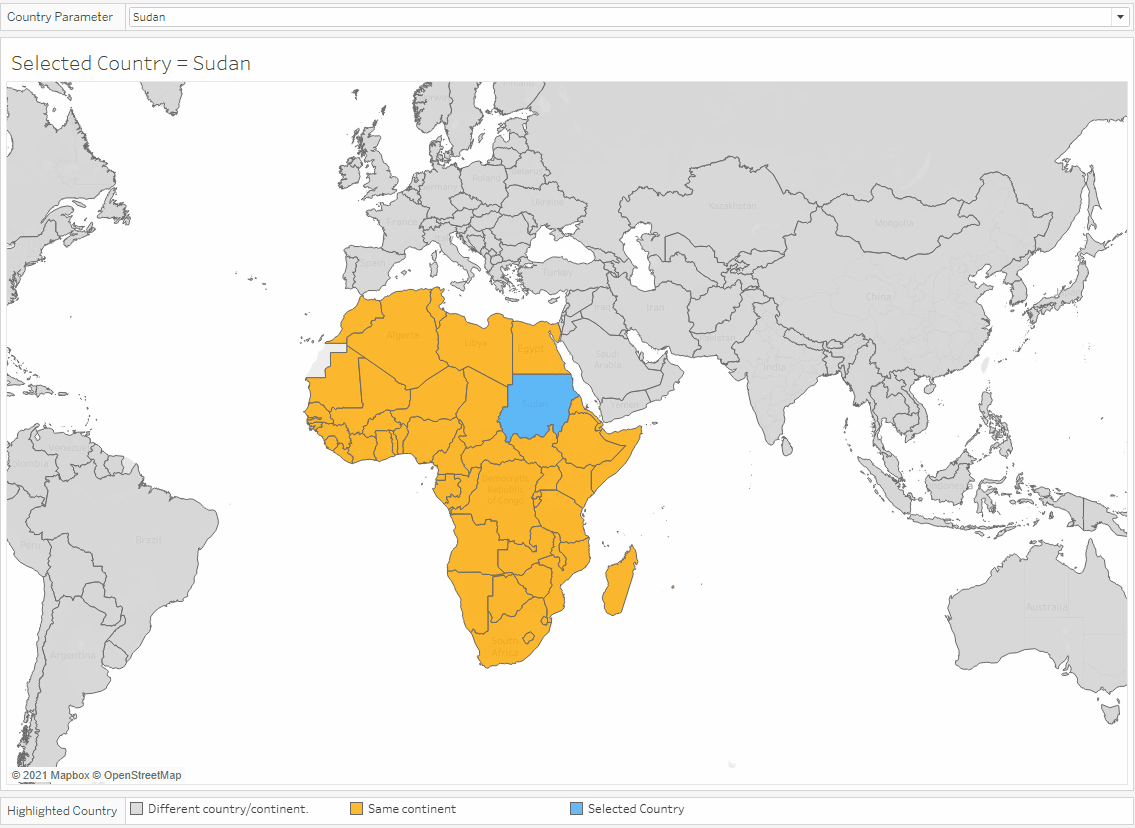
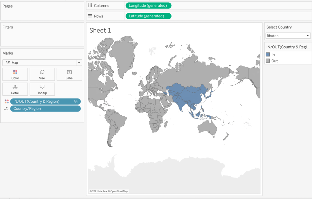
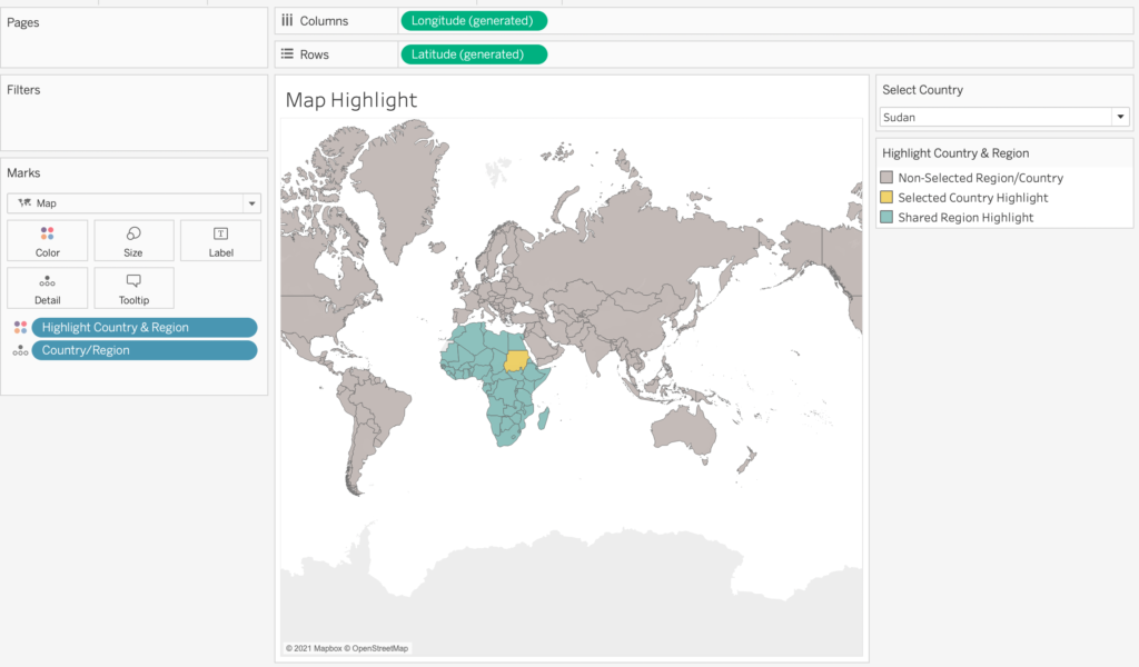
The image below indicates the result I wish to achieve.

In the image above, I have a parameter to select a country (‘Sudan’).
Blue indicates the chosen country (‘Sudan) while yellow shows all other countries with the same region (‘Africa’). Non-African countries retain the default grey. The animation below shows how the visual updates as I randomly select different countries.
Using the World Indicators dataset, I created a set based on the region dimension with the condition that allowed the set to be dependent on the output of a parameter, allowing me to highlight (or filter) the view based on a shared region attribute.
Step by step
Open Tableau and select the World Indicators dataset.
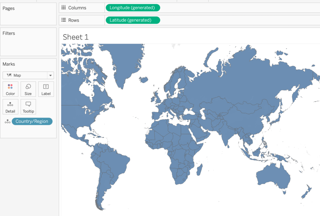
First, let’s get our base map working. Drag the Country/Region pill to the rows shelf and then the maps options on the “Show Me” menu. You should see a filled world map with generated longitude and latitude on the column and rows shelf.
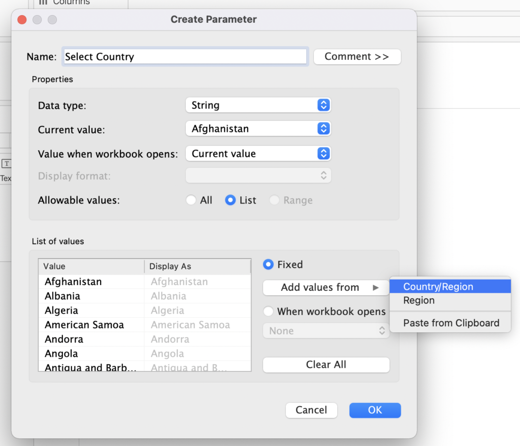
Our next step is to create a parameter that allows us to select a country. Select Create Parameter via the relevant menu in the data pane. Call it Select Country, make sure we set the data type to string, and then set allowable values to list. Add these values from the already created Country/Region field. You can then add this parameter to the sheet if you wish.
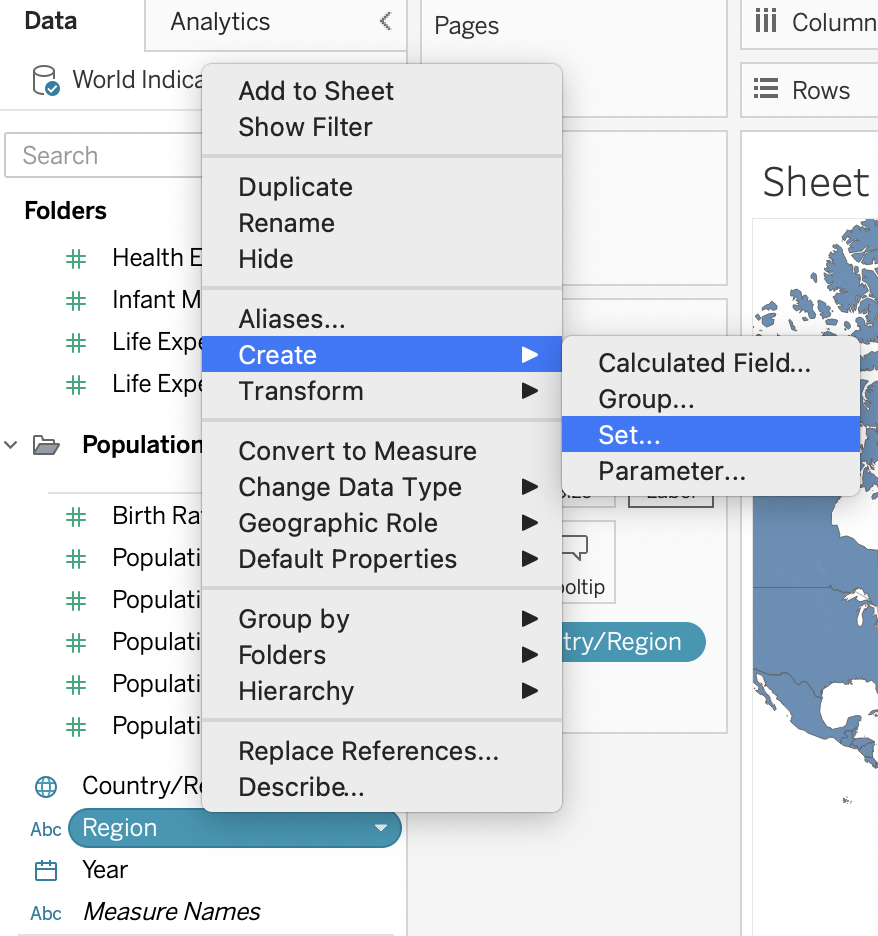
Now the fun starts – we get started with creating a SET! We will make a set to filter all countries that share the same region in the Select Country parameter. First off, select the region dimension, right-click to access the context menu and then select CREATE > SET.
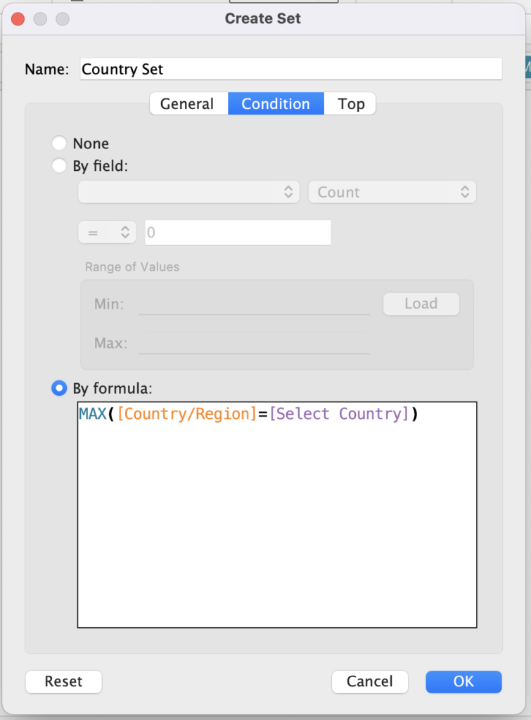
Change the set’s name to Country Set in the create set dialog, then navigate to the Condition tab. We now want to use a formula as the set’s condition – specifically the formula MAX([Country/Region]=[Select Country]). This formula says: place into the set all regions where the maximum of the [country/region] dimension is equal to whatever is currently selected in the Select Country parameter.
If you were to now place this newly create set on the colour mark in the current view, you would notice we have the functionality we want almost working! Changing the parameter of the select country will select ALL countries that share the same region as the selected countries (i.e. they will be considered IN the Country Set while all other values will be OUT).
However, this is not exactly what we’re after: we wish to highlight the selected country and the other countries that share the same region as the selected. We’re now required to build a few calculations.
This next part is fairly straightforward; we now want a conditional colour highlighter. We’ve got three options to consider: (1) the country currently selected in our Select Country parameter, (2) the countries that share the same region as the parameter as mentioned earlier, and (3) everything else that falls outside these criteria. A simple IF..THEN..ELSE will suffice for this task.
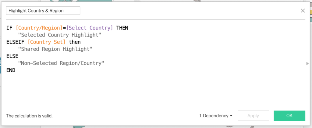
Then all you need to do is drag this new calculation to the colour mark of your visualisation and set the appropriate colours. I’ve chosen yellow for the selected country, blue for countries from the same region, and grey for all other options.

Voila! Functionality complete. Revel in your new achievement!
While I’ve used this technique as a conditional map highlighter, there are a few other use cases, including filtering (where you’d manipulate the filter pane by dragging in the set created above).
It’s likely that this is not the only way to fulfil this use case. If you have any other ideas, suggestions or constructive criticism, please get in contact via Twitter (@dbfmurray).
If you’d like to play around with a copy of the above map highlighter and tinker/explore the calculations, you can view/download a copy of the work book by clicking the link below.
Have a great day!
Leave a Reply
You must be logged in to post a comment.