
Last week I was fortunate enough to be awarded my first ever ‘Viz of the Day’ (or VOTD). The more expansive (and I think better version) of the visualisation can be found on my Tableau Public profile.
If you don’t have a clue about what I’m talking about, Tableau – the purveyor of fine data visualisation software – regularly select a visualisation from the community to showcase most weekdays. Typically, VOTD often showcases an interesting new technique or visualisations that provide information on current news or relevant historical events or generates fascinating new insights.
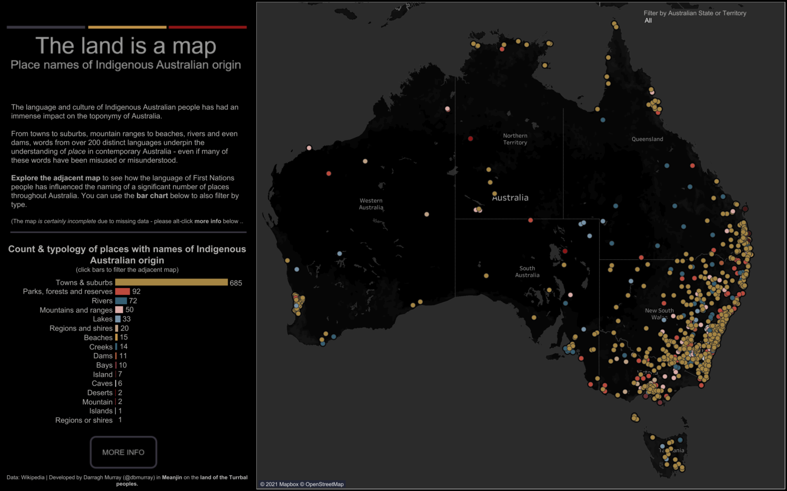
In the case of my visualisation – The Land is a Map – it fell squarely in the latter category. This visualisation is essentially a map of places within Australia that have, or are derived from, the language and culture of Indigenous Australians.
The visualisation allowed the viewer to scan over areas of Australia and find out what towns or geographic features (like mountains, rivers or beaches) had names that came from Indigenous culture. This viz was highly relevant given that I published it during NAIDOC Week, a week that celebrates the culture of Indigenous peoples in Australia.
In saying all this, I acknowledge that many places are missing from the map, and this is primarily due to the quality of the source used to construct the underlying dataset.
While the visualisation itself is nothing groundbreaking (it’s just a map, after all), the content may not precisely have precedent. I haven’t been able to find an existing visual resource that has the same scope (though I’ll link below to a few relevant articles, sites that may have overlaps).
While I don’t think I had been explicit in the past, I had been hopeful of being awarded VOTD at some point. I’m not a prolific Tableau Public publisher by any means, and I still think I’ve got a long way to go to be as good a designer as many in the datafam, but still, I had been hoping of snagging the sought after VOTD honour. So as you can imagine, I was pretty happy to wake up and see the VOTD email come through with my name attached!
However, what I think has made me more proud is that since publishing, I’ve had many folks (strangers and friends) reach out and say how much they enjoyed it and that they have learned something about their local area. That is the best feeling – the feeling that some work you spent your weekend (and free time) putting together has impacted others.
That’s why I strive to improve my data visualisation skills continually – it’s the best way I know of being able to create work that may have meaning in the world.
PS. Much of the work behind this viz was done using R, which I’ve been continually experimenting with over the last six months. I’m planning to write a tutorial/explainer soon on how I use R to geocode all these locations from the Wikipedia data I used as the source. So stay tuned.
Leave a Reply
You must be logged in to post a comment.