
COVID-19 induced isolation has been good to me in terms of getting time to do some Tableau work. I had my heart set on completing my first ever Iron Quest submission. This months theme was the “Quantified Self”. As soon as I read about the theme, I immediately knew what I wanted to visualise: the cycling history.
What’s Iron Quest?
For those not in the know Iron Quest is an initiative begun by Sarah Bartlett. Sarah describes it on her website as:
Iron Quest is a monthly community-led data visualization project which follows a similar format to the Tableau Iron Viz feeder competitions. Participants have a calendar month to source a suitable data set and then design, build and submit a data visualization. Every submission should use a data set that somehow touches upon the chosen theme for that month and every viz should aim to showcase best practices & skill in design, storytelling & analysis
Data sets
Gathering the data was straight forward. I knew I’d use my logged Strava data, which I could easily export by a service I use to track cycling analytics, VeloViewer.
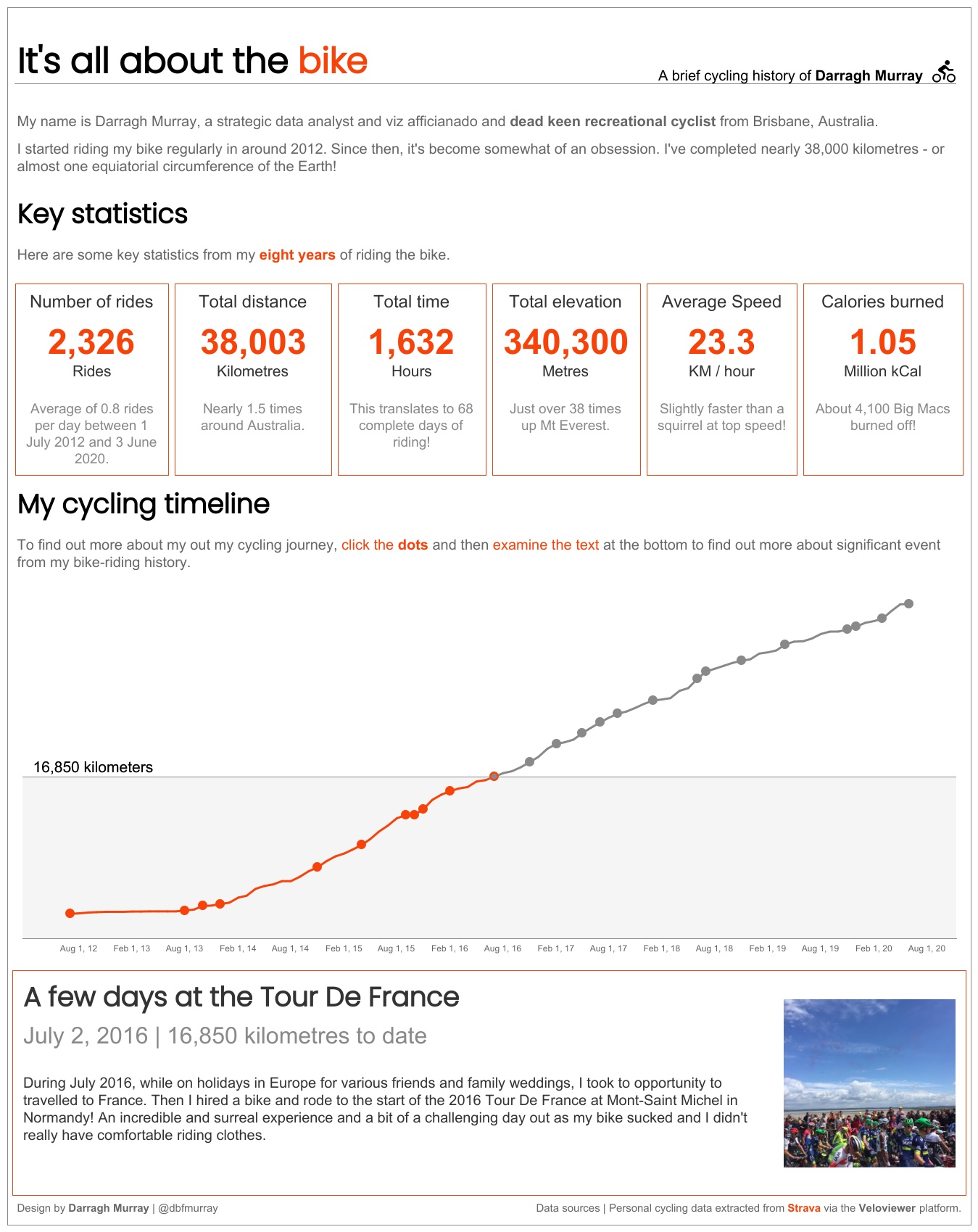
The finished visualisation
Below is what I ended up building. This probably took me about a day to create, spread over multiple sessions. Click on the image below to access the Tableau Public version or simply click this link.
Design thoughts.
I sat down about a week and a bit ago and sketched out some very rough ideas about how to I thought the design would come together. I’m more inclined to clean visualisation designs using familiar chart types (lines, bars, definitely not pie) but adding in some innovative interactive elements that give me an opportunity to learn.
This was my first sketch.
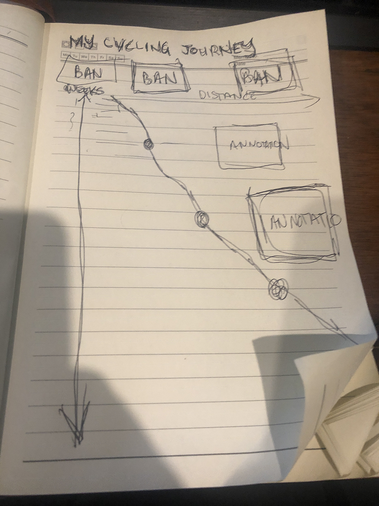
My ideas centered around a vertical orientated line chart that had the running sum of my total logged cycling kilometres on the Y axis. I had planned to also annotate various milestones on the chart to give the visualisation the personal storytelling aspects I wanted to provide as an output.
Armed with cleaned up data and the germ of a design ideas, I jumped into Tableau Public to start implementing my ideas.
Enter the timeline
After some initial experiments trying to recreate a design similar to my hand drawn scrawl, I abandoned the idea of using annotations to create a sense of ‘story’. I ran into some issues with scrolling, and the annotations jumped around depending on screen resolution. It wasn’t an ideal solution in the end.
My mind quickly turned to other options and I recalled reading this excellent tutorial on scrollable timelines done recently by the legendary Ken Flerlage (go read his tutorial and bookmark the Flerlage Twins site while you’re at it).
While Ken’s tutorial dealt with a straight horizontal line, I wondered if the logic could be applied to line charts using time as a dependent variable. And with the right setup, it sure can!
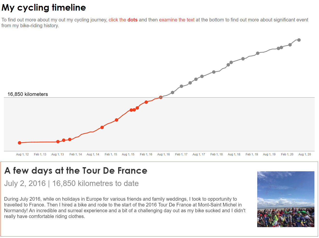
As you can see below, I ended up using a few elements together including a clickable line chart with a dynamic reference line. Clicking on a dot in the timeline also changes the narrative and image below the chart.
I ended up borrowing heavily from many ideas Ken documented in his tutorial though didn’t implement all of them. For example, I didn’t use buttons to move the timeline around and didn’t implement the toggle/no toggle trick he mentions in his post – mainly because it seemed to cause havoc with my dual axis line chart. I’m sure it could be solved (possibly super easily), but I ran out of time to test.
I really loved Ken’s changing coloured dots and lines technique and spent a few hours blatantly plagarising the technique for my viz as well. This meant a bit of time doing some basic graphic design in GNU Image Manipulation Program to create my custom shapes.
One problematic part of the build of the timeline was getting the bottom text to change correctly when a mark was clicked on the line chart. I spent a few hours scratching my head with this part of Ken’s tutorial, but a bit of research regarding parameter actions – which I had not really used before – and making sure the right linking variable was available to the worksheet with the line chart and also the worksheet with the text was the key to cracking this issue.
The dynamic reference line
While I was building the line chart, I was struck by the idea that it would be cool to have a reference line that followed the marks around.
I thought ‘surely someone has done dynamic reference lines before?’ Sure enough the great Andy Kriebel had the exact tutorial to fit the bill.
However, after adding in this dynamic reference line, I came across a dilemma. Do I keep the Y axis?
I agonised over whether to keep or remove the Y axis. The purist in me demanded I keep it. But in the end, I made the decision to remove it – mainly to keep a clean aesthetic and also to make sure the dynamic reference line (with the Y axis value) was brought to the forefront of the visualisation. I reasoned that it was fine as the dynamic reference line fills in as a pseudo Y axis.
Dynamic image changing
Sitting back and looking at my emerging data story, I was sitting back thinking ‘could I make this better?’ I thought it might be nice to have a little image pop up beside each event to give the bottom panel a bit of more aesthetic appeal and draw the reader in.
Finding out how to do this was fairly straightforward and it involved using custom shapes to associate a particular image with an ‘event’ on the time line. The tutorial I used can be viewed on Youtube.
All about the BANs
I was nearly done. The only thing left was to do was add in a few BANs (big a$$ numbers!) that quickly summarised where I was at with my cycling. This was fairly straight forward.
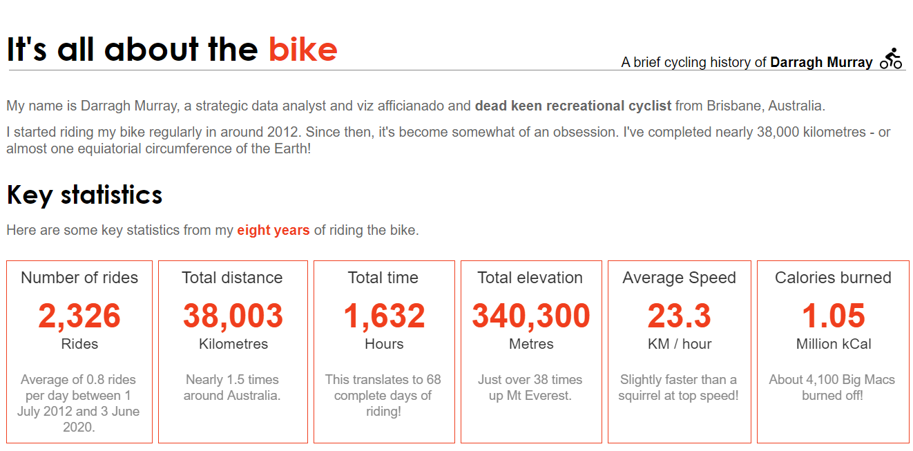
Along with the actual metrics I added in a data element that helped give a bit of descriptive context (and mildly humorous commentary, emphasis on mild) to the BANs. I like how they turned out.
Other aesthetic choices
As you can see, I kept the fonts fairly simple. Using Century Gothic for headers and Arial for most of the rest of the text. Colour choices were limited to four: Black, white, a vibrant orange and also a dark gray. If you’ve ever used Strava, you’ll know what inspired me. I also used a bit of border manipulation to frame the viz. While not exactly the same technique, I did draw some inspiration from some recent work from Sarah Bartlett and Judit Bekker.
Concluding thoughts and acknowledgements
In the end, I’m pretty pleased with how it turned out. I achieved my goal of a clean design that incorporated familiar chart types but still had some fun and innovative elements.
The only thing that I wish I had a bit more time to fix is the toggle on/off function that Ken used in his scrollable timeline so users can only click the dots on the line chart rather than any part of the line.
Shout out to some other Tableau developers whose works I leaned heavily on to develop this IronQuest entry: Ken Flerlage, Andy Kriebel and Sarah Bartlett (all of whom I’ve linked to above).
If you’ve got any constructive criticism or comments or wanted to know how I did anything, feel free to reach out to me either by commenting on this post (which I think still works) or better yet dropping me a line via Twitter.
Leave a Reply
You must be logged in to post a comment.