
The index chart is a chart type that often comes in extremely useful for analysing the change in time series data.
You’ve probably seen these charts frequently used in finance – such as tracking a financial index like the S&P500. Here’s an example pulled from Statista looking at US Stock Indices since the start of 2022.
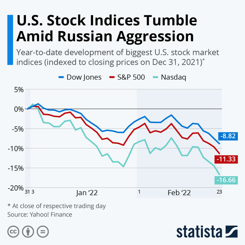
Notice how all series start at the same point, and the chart plots the relative change in each series over time. We can immediately see that NASDAQ has performed relatively poorer than the Dow Jones and S&P 500 during this period.
As you might understand from the above example, the index chart allows one to measure relative percentage change – typically over time. It’s often a handy method for comparing time series data, particularly if there is wide variation in the magnitude of that data (i.e. very large and very small numbers in the same data set).
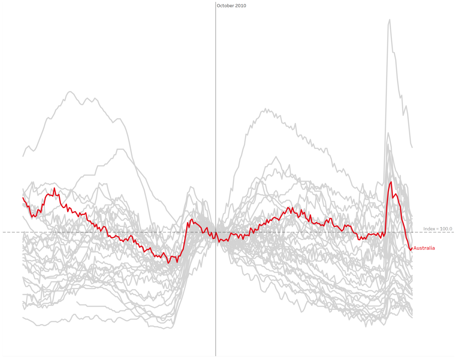
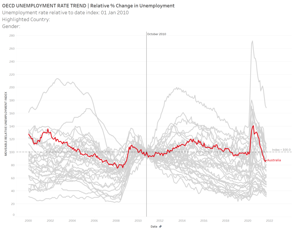
Index charts are not strictly limited to analysing financial markets and can be used in many different contexts, such as monitoring changes in OECD unemployment and so forth. I used it myself in an early round of the Back2VizBasics challenge on dates and lines to compare relatively change in OECD unemployment rates in different countries over time.
You can see the Tableau visualisation below.
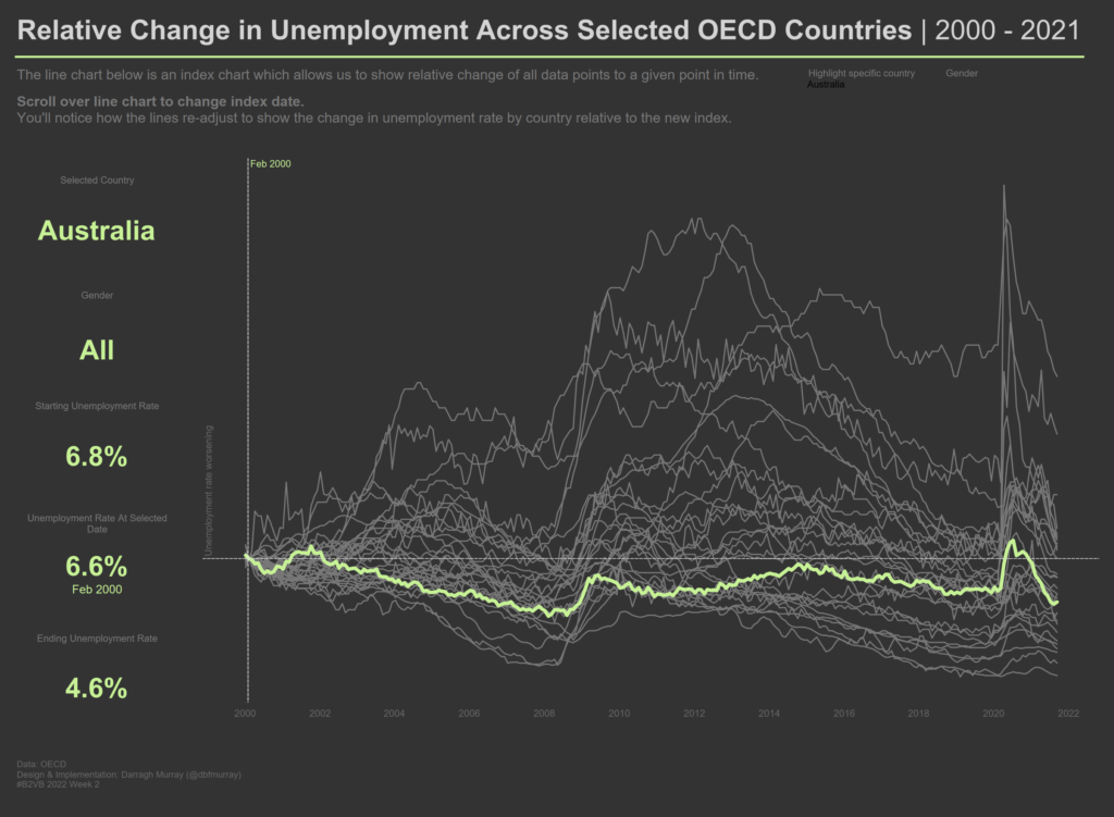
Not only did I build an index chart using this data, but I also made it dynamic. Meaning, that as the user scrolled through time, the chart re-indexes to the selected period. It’s an interesting effect, even if it may be a bit impractical for serious analysis.
Make your own using Tableau
In the rest of this blog, I want to show you a straightforward example of building a dynamic index chart using a parameter using Tableau. I will use similar data to the original Back2VizBasics dataset I used when creating my dynamic index chart of OECD unemployment rates above (I’ve tweaked the date format to a standard yyyy-mm-dd format).
I’ve assumed some familiarity with Tableau i.e you know how to load in data, move fields around the pane and create basic calculations and parameters.
Download and load the data into Tableau, and then we’ll get started.
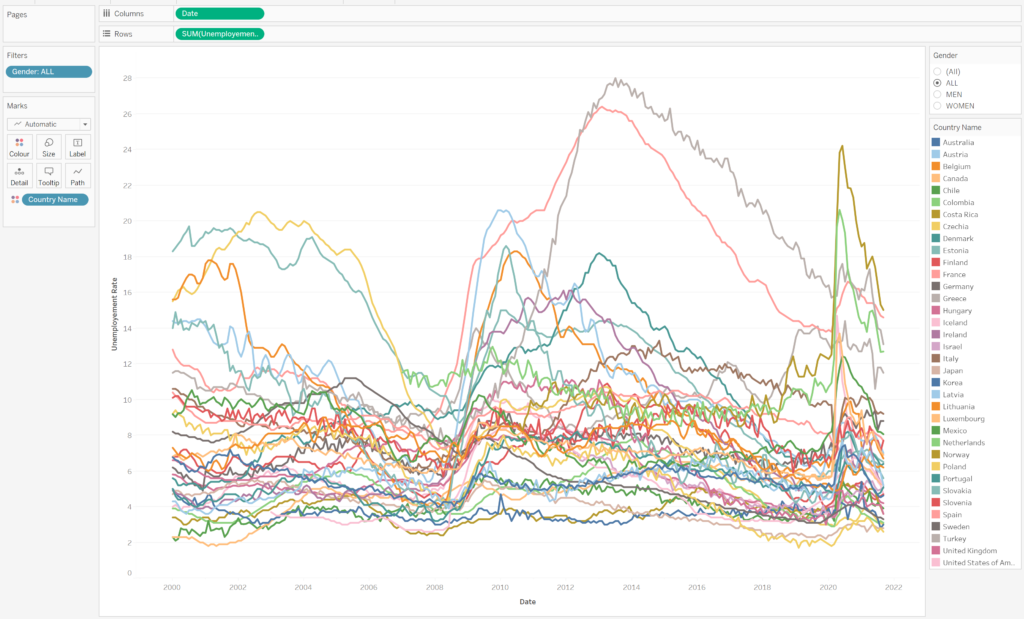
Bring in your key dimensions, measures and filters to the pane.
The date field should go to columns and the unemployment rate field to rows, whereas the country should go on colour or detail to create individual series for each country. I’m going to use colour ’cause I like colour. Set your date field to continuous, so it makes a nice time series.
Also, because the dataset has a ‘gender’ dimension that provides unemployment rates in terms of male, female and ‘all’, bring that field to the filter pane and set its value to ‘all’ for the time being. Doing this means the unemployment rates for this dimension don’t aggregate together.
You should now see something similar to the figure below.
Recapping the instructions briefly:
- Load in the OECD Unemployment dataset.
- Date to columns
- Unemployment rate to rows
- Gender to filter panel – set to ‘all’
Building and analysing an index
You’ll note that this bunch of squiggles tells you which countries have higher or lower unemployment rates. Still, it can be challenging to understand which countries have performed relatively better or worse over time compared to where they started.
Let’s look at the example from the data of Japan versus Slovakia by filtering for these two countries specifically. Which has performed better over time?
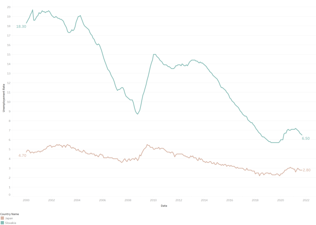
One answer is that Japan has performed better as its unemployment rate has been consistently lower during the period we’re analysing.
Another answer might be that Slovakia has performed better as it started with relatively higher unemployment but has had relatively lower unemployment. There has been a more significant change in unemployment. However, it’s challenging to visualise the magnitude of change without manually calculating the differences. By converting this data to an index, we can see this change far more clearly.
Let’s create a table calculation called RELATIVE UNEMPLOYMENT INDEX.
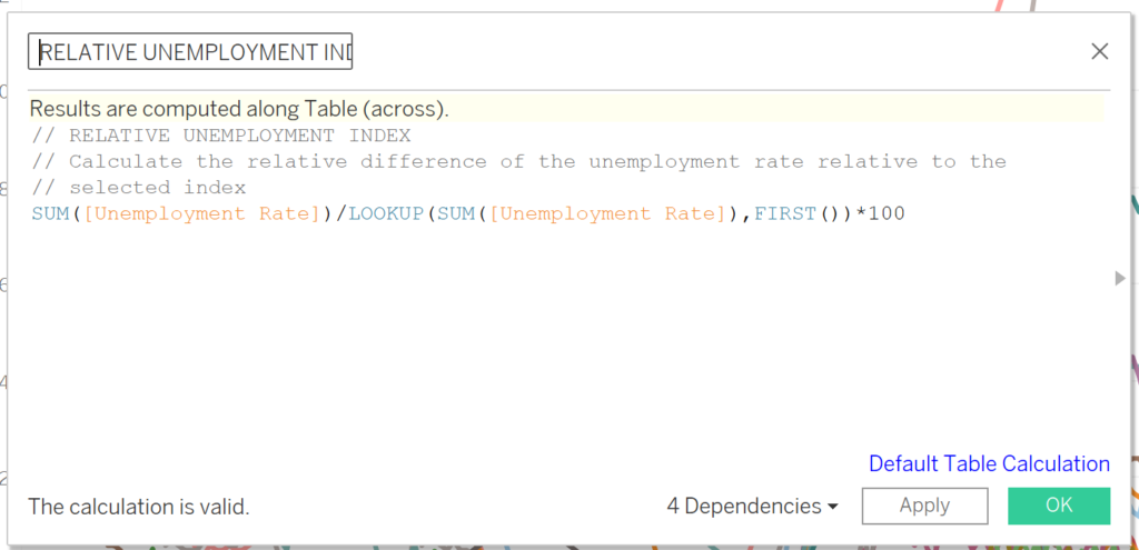
// 1. RELATIVE UNEMPLOYMENT INDEX

// Calculate the relative difference of the unemployment rate relative to // the selected index

SUM([Unemployment Rate])/LOOKUP(SUM([Unemployment Rate]),FIRST())*100
What this calculation is doing is that for _any_ unemployment rate, it does a % change calculation relative to the first date in the data set (which is what the first() function does in this calculation).
It then multiplies by 100 to establish our index starting point (100 will be the relative index).
Adjusting our Japan v Slovakia example by replacing the unemployment rate with our newly created calculation and adding a reference line for our index (a constant of 100), our visual now looks like this.
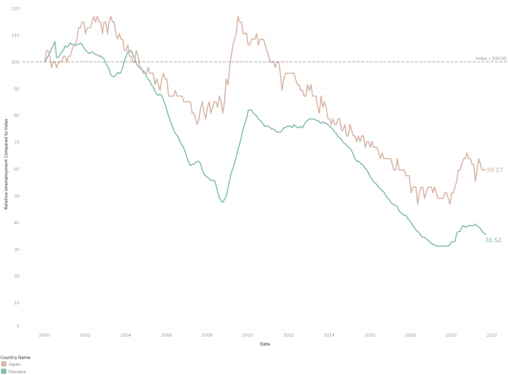
We can now see that Slovakia has performed much better than Japan compared to where it started, with its indexed unemployment dropping by around 64 points since 2000 compared to Japan’s drop of 40.43 points.
Removing your Japan and Slovakia filters and showing all countries, we can now see which countries have performed better or worse relative to their starting index.
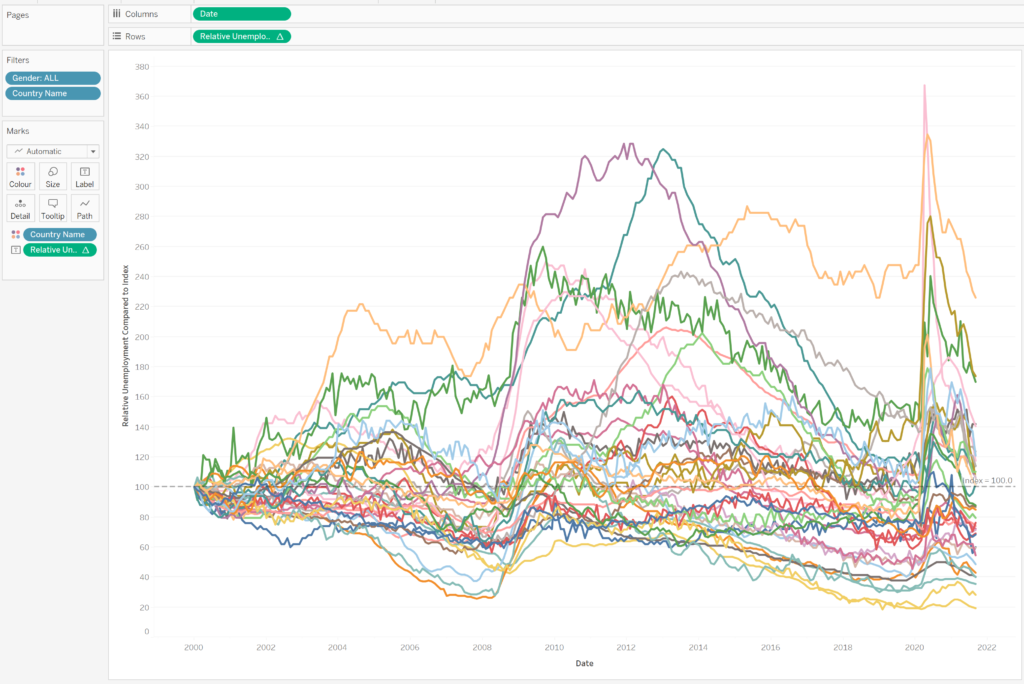
It’s interesting to compare some of the best and worst performers: Poland & Luxembourg.
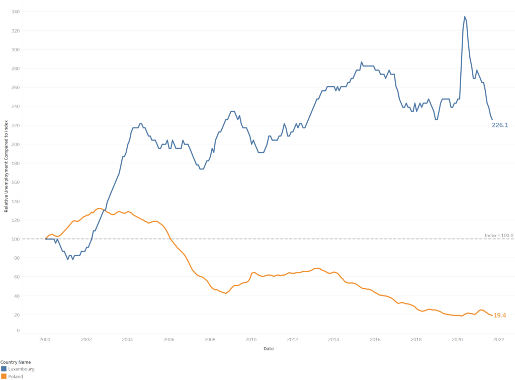
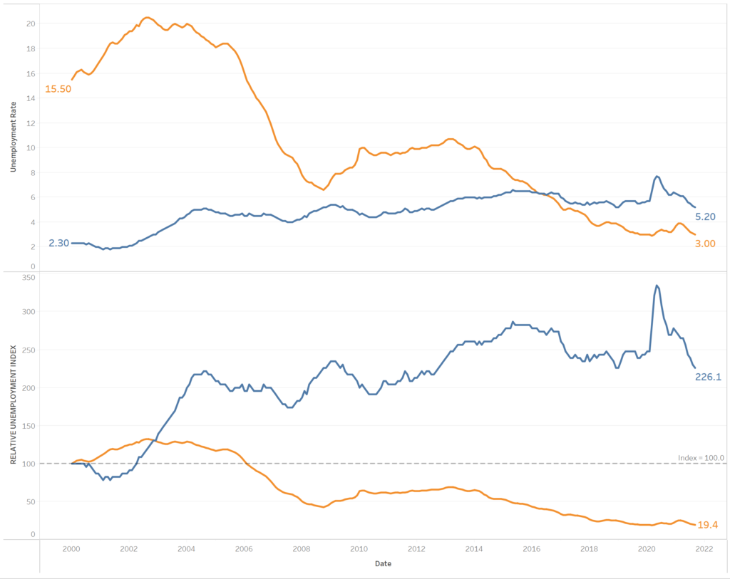
Putting these countries in context with their unemployment rate, we can see the story the index chart tells. Despite Luxembourg’s lower overall unemployment rate for most of the period 2000 to 2002, Poland has performed admirably in cutting its relatively high unemployment early in the 21st century (15.5%) to one that is somewhat acceptable by world standards (3%).
By contrast, Luxembourg has performed relatively poorly compared to its unemployment rate in 2000, with its index rising by 126.1 points to 2022.
Recapping the instructions:
- Create a new calculation: relative unemployment index (code is above).
- On your pane, replace the unemployment measure with relative unemployment index.
Making the index dynamic
What if you want to make the index start point dynamic? That is, start the index at any point along a timeline and see change relative to that point?
This addition is straightforward in Tableau, and you can complete this using a parameter and a minor adjustment to our calculation from the previous section.
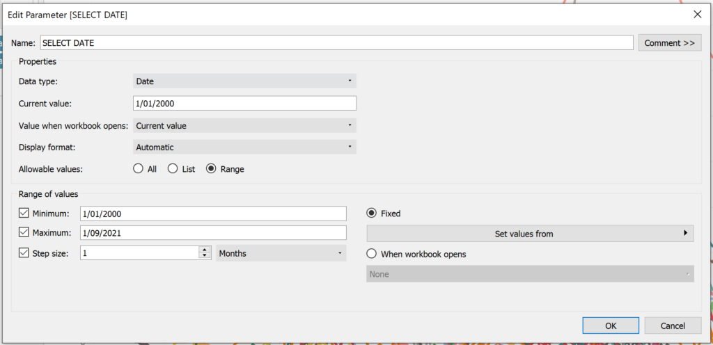
First, let’s create a date parameter which will function as our input. I’ve called mine SELECT DATE and configured it as shown below, but you can adjust these to suit your use case:
- Data type: Date
- Current value: 1/01/2000
- Allowable values: Range
- Range of values: Fixed – set from the relevant date field in the dataset
- Step size: 1 month
Now to use this parameter in our chart, we have to go back to the logic of our original index calculation. I’ve highlighted the relevant bit of the calculation in the figure below.
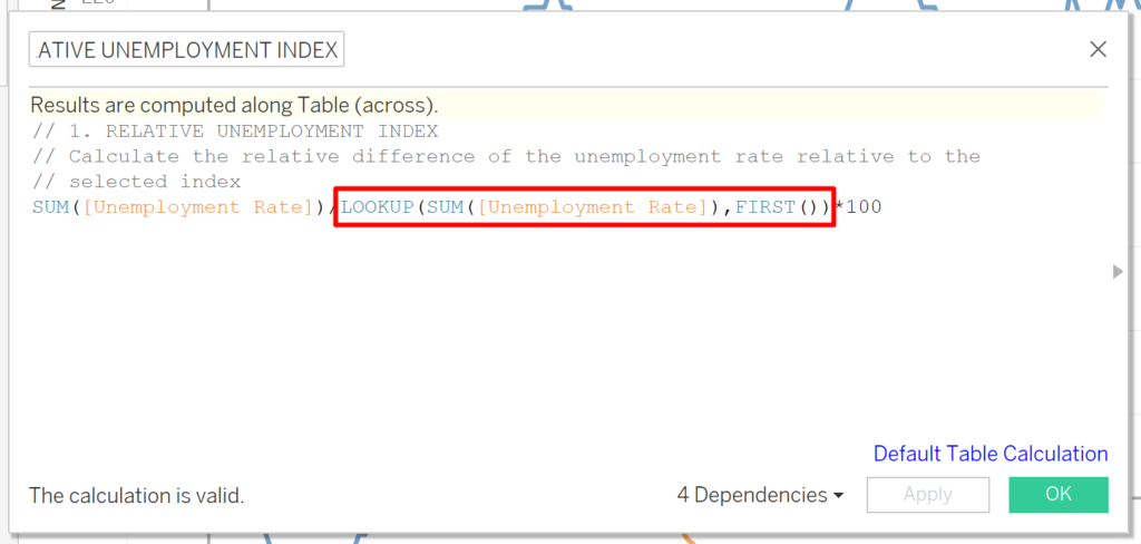
This calculation works by comparing the current value to the first value for each country. But now we want to shift the first value!
So we need to build an offset for this calculation, which means making a new calculation to measure the difference in months between the earliest date available for each country and the date selected by the user in the parameter. Here’s the process:
First, create a fixed level of detail calculation (LOD) to calculate the earliest date for each country: EARLIEST DATE BY COUNTRY.
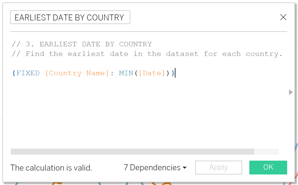
{FIXED [Country Name]: MIN([Date])}
Then we use this LOD in a calculation (along with the previously coded parameter) to calculate the difference in months between the earliest date for each country and the value of the parameter: INDEX MONTH OFFSET.
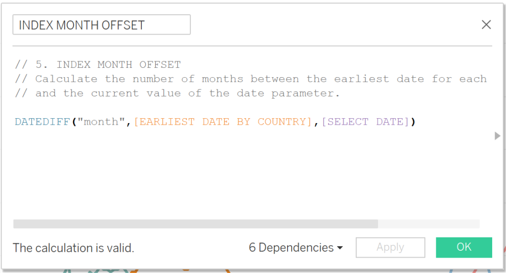
DATEDIFF("month",[EARLIEST DATE BY COUNTRY],[SELECT DATE])
We next have to calculate the earliest available date for each country in the dataset as not every country’s earliest date data starts at the same time.
Now we can create a new calculation called MOVEABLE RELATIVE UNEMPLOYMENT INDEX which will shift the start point of the index and recalculate all percentage changes along the timeline.
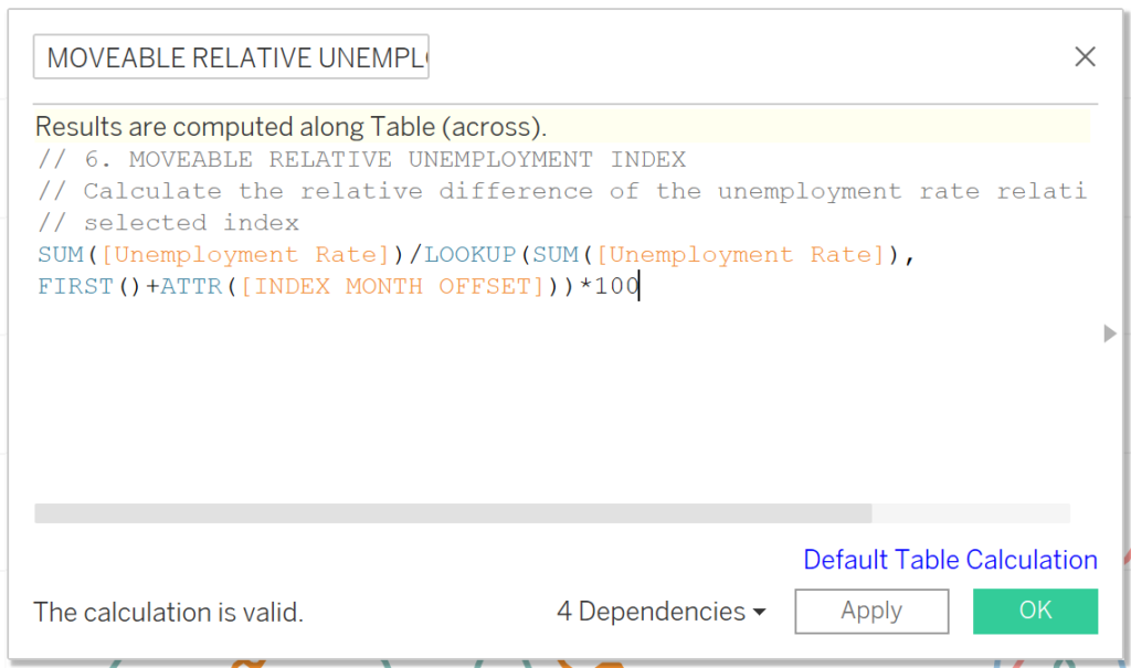
SUM([Unemployment Rate])/LOOKUP(SUM([Unemployment Rate]),

FIRST()+ATTR([INDEX MONTH OFFSET]))*100
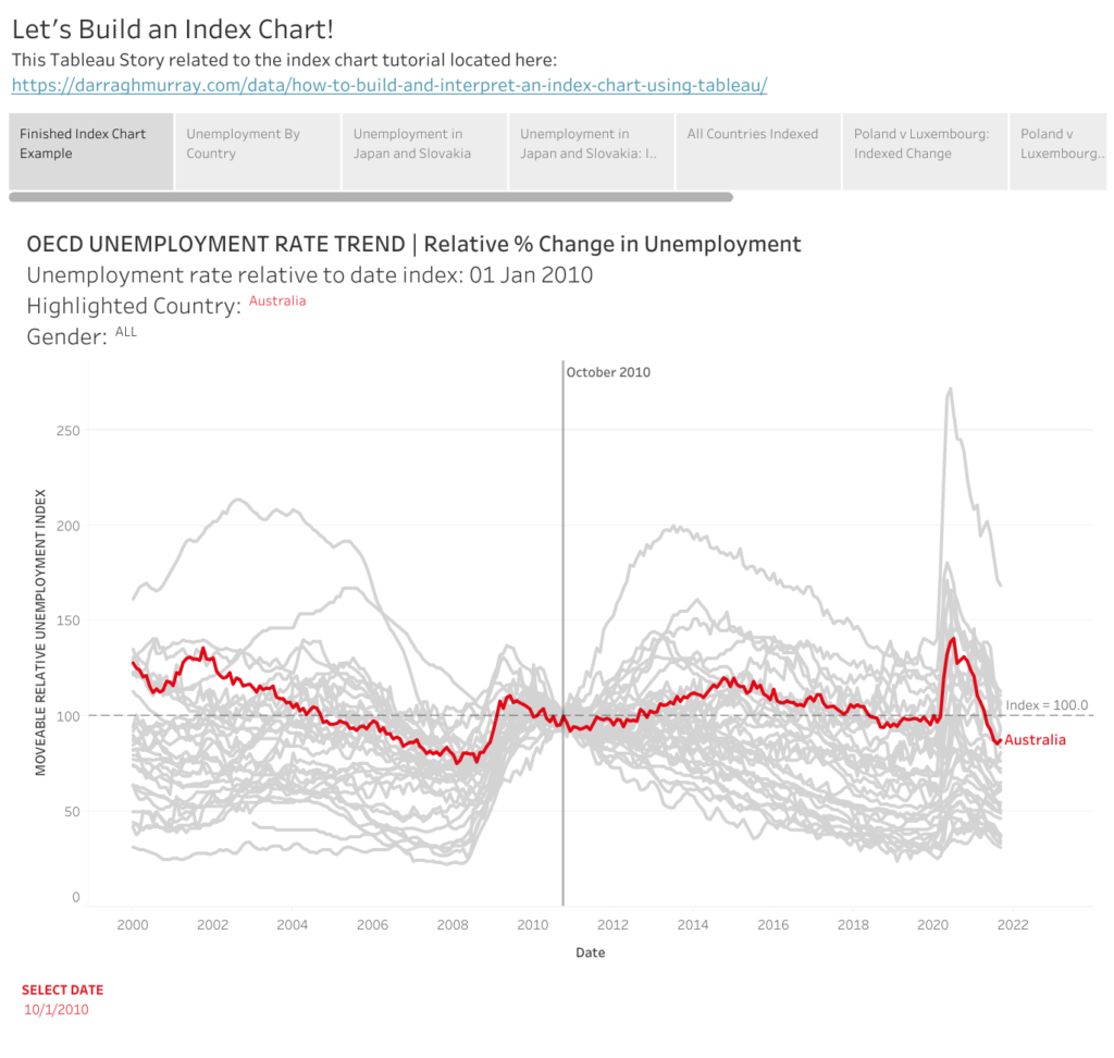
We now have all the calculations in place to create a dynamic index chart. Let’s go back to one of our worksheets and replace your previous produced RELATIVE UNEMPLOYMENT INDEX pills with your new MOVEABLE RELATIVE UNEMPLOYMENT INDEX, as shown in the figure below.
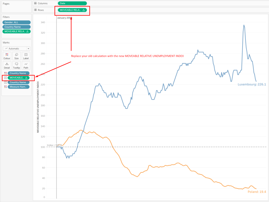
All you need to do now is add your date parameter to the view, and voila! You’ve got a dynamic moveable index chart. Check out this gif below with all countries included and the parameterised date changing to get a feel for how the chart works.
To recap:
- Create a date parameter – Select Date
- Create a new level of detail calculation – Earliest Date by Country
- Create another calculation – Index Month Offset
- Create a duplicate of your previous create calculation, Relative Unemployment Index, and modify it to use your Index Month Offset (instructions above), call this new calculation Moveable Relative Unemployment Index
- Replace Relative Unemployment Index in your visualisation with the new calculation Moveable Relative Unemployment Index.
- Add the Select Date parameter to your view, and now you can use this to control the index.
A few little tweaks
You can also add in a few little tweaks to provide a deeper layer of analysis and insight, such as:
- Add a reference line that tracks where the selected date intersects with the timeline so you can quickly tell visually where the indexed values start.
- Use a parameter to highlight specific countries for analysis.
It may end up something like this:
Follow along with using my Tableau Workbook
If you want to download an example workbook with all the calculations, you’re more than welcome to grab it from my Tableau Public Profile. Click the image (or this link) below to go to the page and then find the download option.
Thank you for reading through this tutorial; I hope you find it helpful.
I’d love to see your own use of index charts! So if you have any questions or comments or an index chart to share, please feel free to reach out via Twitter: @dbfmurray.
Leave a Reply
You must be logged in to post a comment.