Given that I’m a vegetarian, this week’s #MakeoverMonday was particularly relevant. We were asked to visualise some data regarding animal-free consumption in Great Britain.
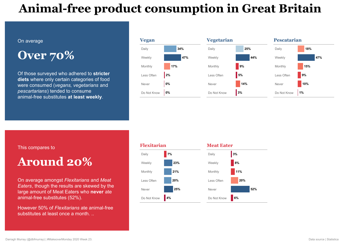
Here’s my effort, actually done in an hour for once!
Click on the image below to see the interactive (or click here).
The original visualisation
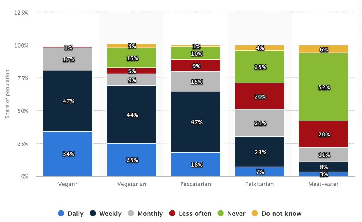
The original visualisation is below.
There are many things I find objectionable about this visualisation. While I often personally use these types of stacked bar charts, this one is sloppy. For instance, the Y axis goes to 125%. The legend might be better off at the top as well.
Design
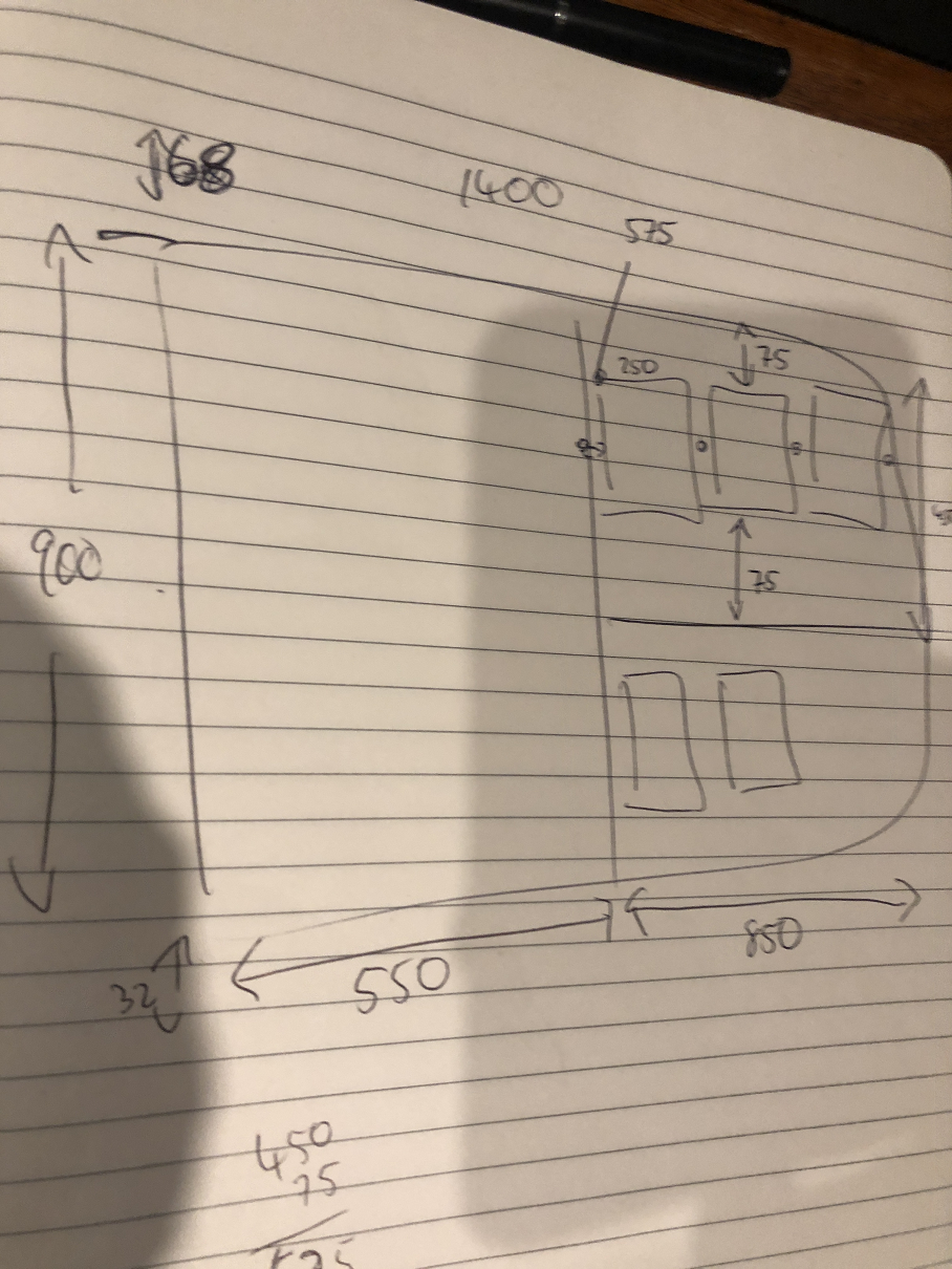
As usual, I started with some rough sketching. I knew I was keen for multiple floating small multiples – one box for each ‘type’ of diet. You’ll see I sketched out the exact pixel dimensions so everything looked correct on the final visualisation.
The data
The data for this one was slightly confusing and it would have been great to see what the original context of the visualisation was in order to make what was being measured slightly clearer.
I’ve assumed that when the data talks about ‘animal-free product’ consumption, they’re actually talking about meat and dairy substitutes e.g. things that look like meat or dairy but are not like soy or almond milk or Beyond mince. Otherwise, I’m not sure it makes sense for the large 14% for the ‘never’ category in the vegetarian column.
I could be totally wrong on this, but that’s my assumption documented :).
As soon as I saw that the data was in likert-scale format, I knew I wanted to go with small multiples. Some pre-processing of the data was done in Tableau Prep. Essentially, I just de-pivoted the original data set which looked like this.
Please feel free to fire me comments and/criticisms via Twitter.


Leave a Reply
You must be logged in to post a comment.