
My entry for the latest #VizForSocialGood Project, examining internally displaced persons and climate change. This was done ahead of the Virtual Refugee Conference during Refugee Week.
I was very happy that my visualisation was chosen as one of the featured visualisations amongst a strong field of participants.
What is Viz for Social Good?
Viz for Social Good is a social enterprise that uses data visauliastion to open up conversation on key issues facing our world. From their website:
Empowering nonprofits through data story
We help mission-driven organizations to promote social good and understand their own data through beautiful and informative data visualization.
Viz For Social Good have done many projects, but this one involved looking at refugee data on behalf of Kiron. Here’s a link to the project specification.
Who are Kiron?
Kiron are a non-government organisation (NGO) who provide refugees (with a focus on those from the Middle East) with free online and top quality courses to improve their future prospects.
From the Kiron website:
We believe that education can change lives, transform communities, and build bridges. That’s why we created the online learning platform Kiron Campus, so we can ensure that our students receive free access to high-quality education for academic, professional and personal growth.
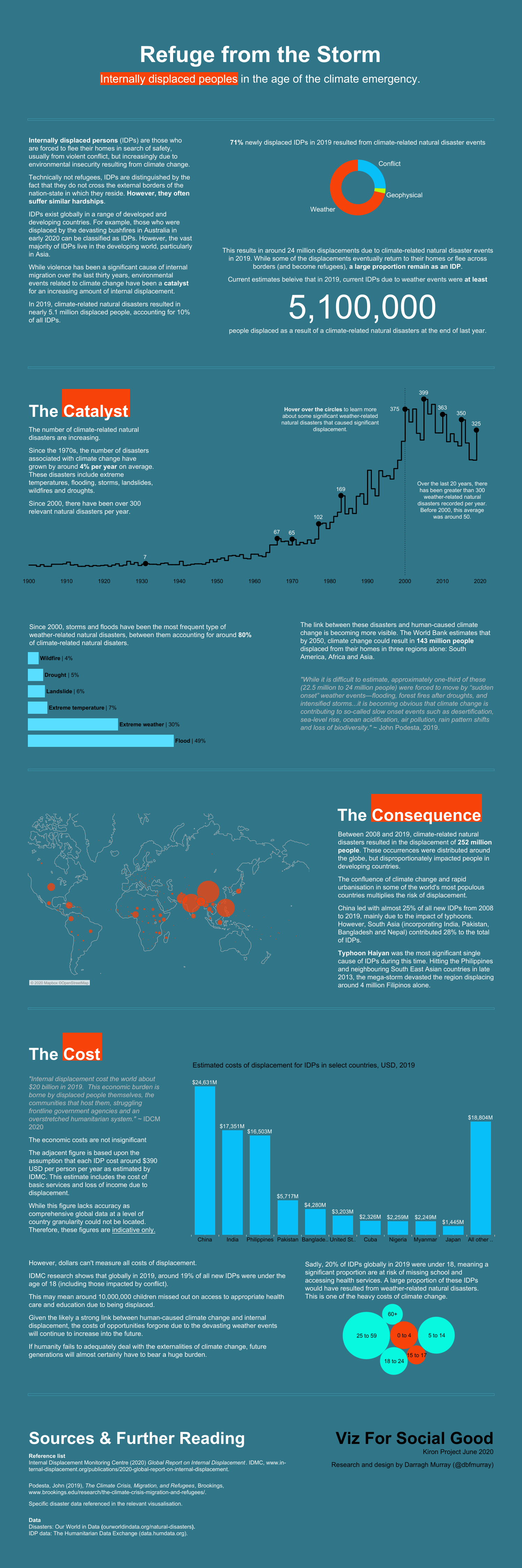
The finished visualisation
Below is the complete visualisation examining the plight of internally displaced people during the age of the climate emergency. You can access the interactive version by clicking on the image or simply by clicking here.
Datasets
I perused countless datasets. In the end, the visualisation is the based on two key data sources.
Firstly, datasets from the Internal Displacement Monitoring Centre, a NGO dedicated to providing high-quality data analysis on the topic of internal displacement, were vitally important. Two datasets looking at total numbers of displaced persons over time, and then also the cause of displacement. I quickly zoned in on the ’causes’ variable, and found it quite interesting (and topical) that so many people ended up being displaced by natural disasters.
The second major dataset used came from Our World In Data – which provided information on total number of natural disasters over the past 120 years. I generally discarded disasters (and displacement) caused by earthquakes and volcanic activity as these are difficult to link to climate change.
Design concept
This time, I started off with an experiment in mind-mapping (something a colleague of mine, Lucy Blakemore, has been doing a lot of late). Here’s my mind map.
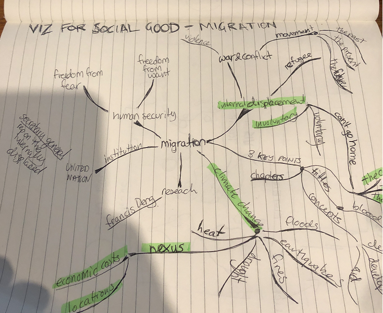
This was a pretty effective way to get some ideas out of the data quickly and you can see where I went with it and how that eventually translated into the finished visualisation, picking up on the concepts of ‘climate change’, a nexus between this and migration.
I quickly also decided I’d investigate internally displaced peoples (IDPs) as it was not a subject I was super familiar with before I undertook this project. IDPs are essentially peoples who have been forced from their home by some external event and have had to flee (hence have been ‘displaced’). Some are displaced temporarily, but often IDPs are kept from their home for many many years – even permanently.
I liked the idea of breaking the context into chapters which I titled ‘The Catalyst’, ‘The Consequences’ and ‘The Cost’. This chapter structure is something I saw done to great effect in Hesham Eissa awesome visualisation on the ‘Global Journey of Refugees’.
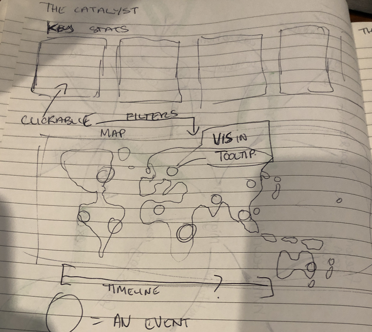
From there, I started sketching out a number of design options. While my initial designs don’t look look much like the finished product, but its really good to start wireframing out potential designs on paper and get the brain thinking about types of features to put on the pane.
The line chart
This is something I saw recently done by Sean Miller (@HipsterVizNinja) do pretty recently (“Virtual Health Care is on the rise“) and I really loved how it looked aesthetically. Basically its just a dual axis line chart, with the line using the ‘path’ line chart and then a dot plot to give the big black dots that are used with tooltips to provide some fun extra context on specific events.
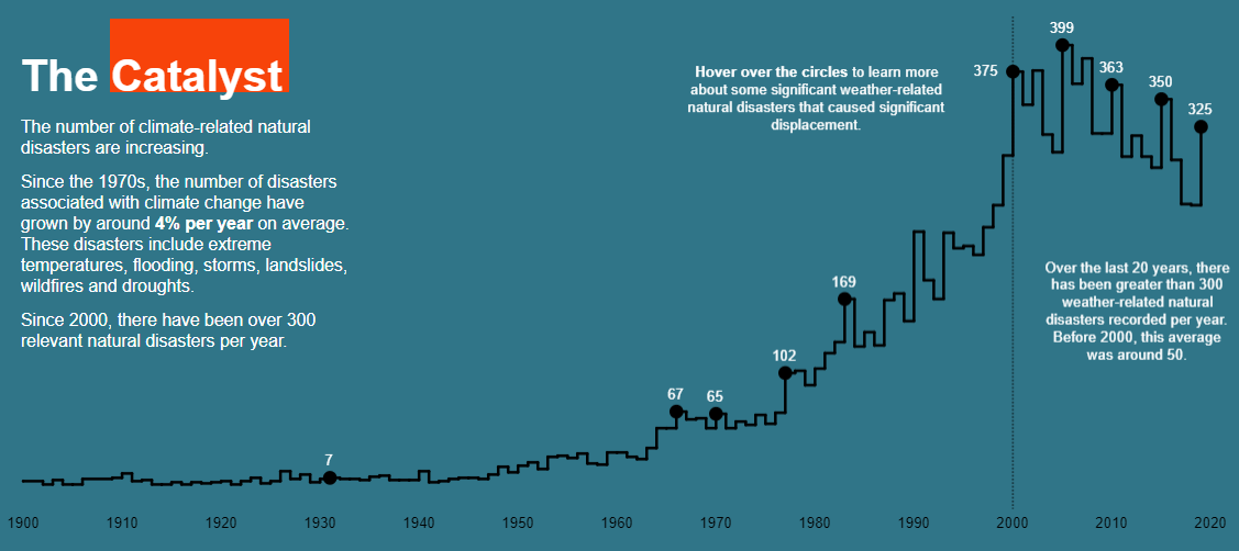
You’ll also note that I extensively used a new technique of floating blank red squares behind key text to draw the eye. This technique was borrowed from the recent work of Judit Bekker (see her great recent visualisation on Lady Gaga).
A lot of time was spent on getting the layout and the negative space correct. Other than that, the rest of the visualisation was fairly straight forward, but I did spend a large amount of time making sure tooltips, fonts and so forth were consistent.
Concluding thoughts and acknowledgements
Obviously I’m pretty happy that the visualisation ended up being featured at the conference. Two parts of the visual that I would have liked more time to work on were in part three, where I looked at cost. Not a heap of good data existed for this, so costs are estimates. I don’t super love the bubble chart, but it does communicate a story that is relevant to education – that being displaced means you’re at risk of not getting a good education.
Must give a shout out to Sean Miller for inspiration on the line chart and also Judit Bekker for the idea around text highlighting.
Leave a Reply
You must be logged in to post a comment.