
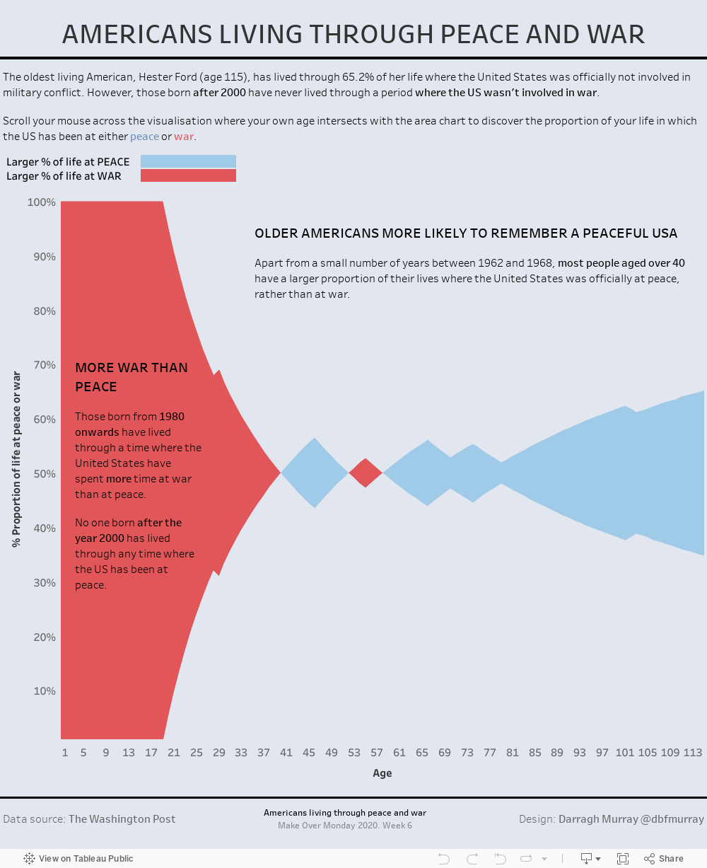
Two weeks in a row now that I’ve managed to get something done for MakeOverMonday. This week’s challenge had us rearranging the visuals of this Washington Post article by Philip Bump titled “Nearly a quarter of Americans have never experienced the U.S. in peace time“.
I’d been procrastinating all week, checking out many great vizzes done by the Tableau community when all of a sudden an alternate design came to me like a bolt from the blue. How about doing something with the inverse of the provided data?
The data provided simply a ‘birth year’ dimension and a ‘% at war’ type measure, but if I simply took that measure from 1, I’d get a ‘% at peace’ variable and I could then do some fun stuff comparing the two proportions. I also decided to conceptualise time in terms of age rather than birth year, as I think it’s more natural to think of oneself in terms of years on Earth.
The result is the below visualisation which uses stacked region charts. I picked up a great little tip from Sean Miller’s website where I learned a nice little LOD technique to colour between the two regions.
As usual, this viz is better looked at on a standard computer desktop rather than mobiles or tablets. I still haven’t mastered presenting in these formats. You can also look at this direct via my Tableau Public gallery.
Leave a Reply
You must be logged in to post a comment.