
Tag: security
-
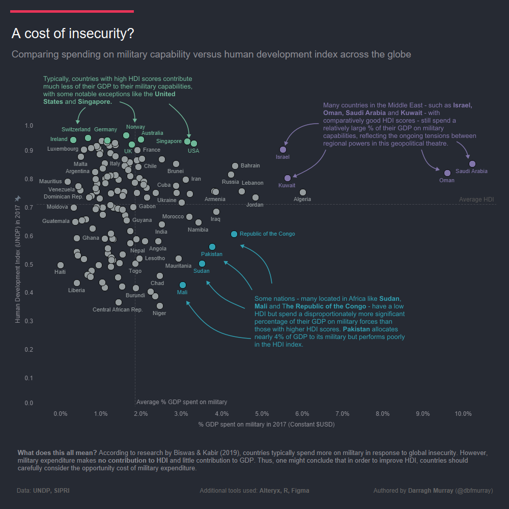
A Cost of Insecurity – Comparing Spending on Military Capability v the Human Development Index
One great thing about the company I work for is that they continually encourage us to develop our skills via monthly data visualisation challenges. The latest challenge was themed on ‘scatter plots’ and it was definitely one I wished to be a part of – I love scatter plots! Harking back to my postgraduate studies…
-
The war over the Internet
If you leave the door open to your house, and someone enters and steals some items, you don’t say you’re at war. You’ve been robbed certainly, but you’re not in a state of war. I completely agree with Sam Roggeveen’s sentiments over at The Intepreter regarding the cyber warfare rhetoric that is doing the rounds…
-
Cybercrime as a security issue.
I’m presently doing a bit of reading into the concepts of cyber warfare and international security. It’s a fascinating and fairly new field and my reading comes at a time when the Australian PM, Julia Gillard, has specifically articulated threats emanating from cyberspace as a security priority for Australia within the next decade. Gillard’s speech…